Editorial design | Print and Digital Magazine
Date: November 2024
Software | Service used: Adobe InDesign, Adobe Photoshop, Adobe Illustrator, Abode Stock, Figma.
Overview
Everybody love food! I adore it and I think is a topic that brings people together. Food can be easily enjoyed by a wide audience, it gives comfort and joy to most and it is present on every special occasion and Holiday. For this reason, I decided to focus this magazine's issue on the Holiday Season.
Senses magazine is transitioning from a traditional magazine to fully digital. Their readers will be able to download issues via iPad & iPhone or read them on their online platform - www.sensesmagazine.com. The magazine will showcase interviews with local Canadian chefs, cooks and restaurants always sharing a recipe after every interview according to the topic/chef’s specialty. The main idea is for readers to engage with the content and discover hidden gastronomic gems and new recipes to try out.
Senses magazine is transitioning from a traditional magazine to fully digital. Their readers will be able to download issues via iPad & iPhone or read them on their online platform - www.sensesmagazine.com. The magazine will showcase interviews with local Canadian chefs, cooks and restaurants always sharing a recipe after every interview according to the topic/chef’s specialty. The main idea is for readers to engage with the content and discover hidden gastronomic gems and new recipes to try out.
My role on this project was as a graphic and layout designer.
Deliverables: Print cover and interior spread, Tablet cover and interior spread, continuous scrolling article content for Mobile and Web. Mock-ups for the 4 platforms in Photoshop.
project rationale
Goals
- Design layouts for 4 different platforms that present the same amount of copy and the same feeling to the readers:
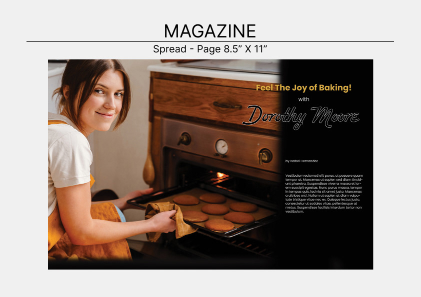
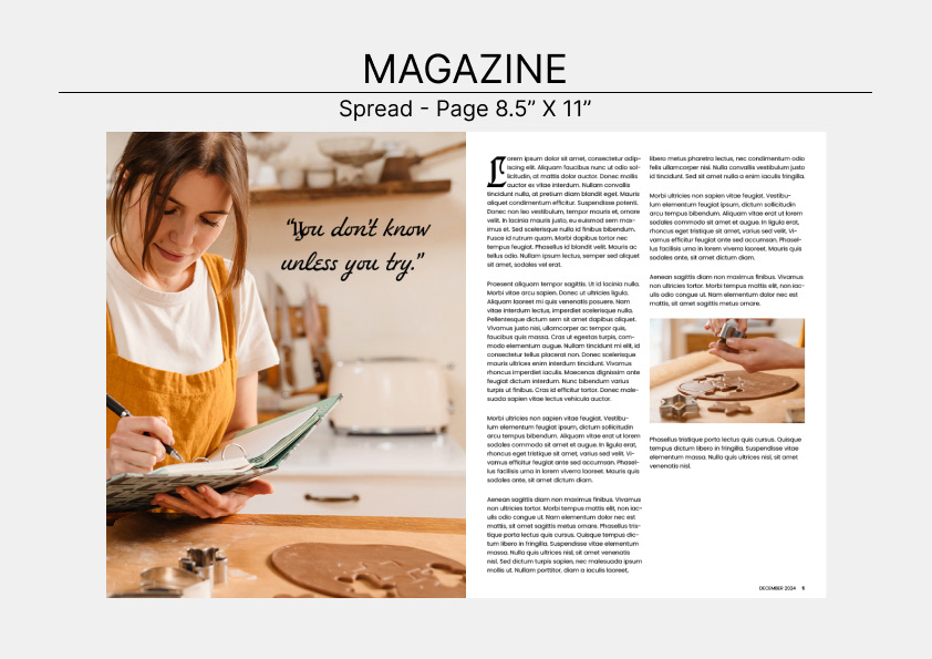
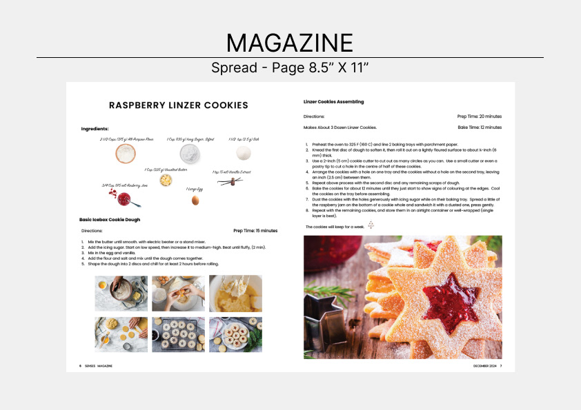
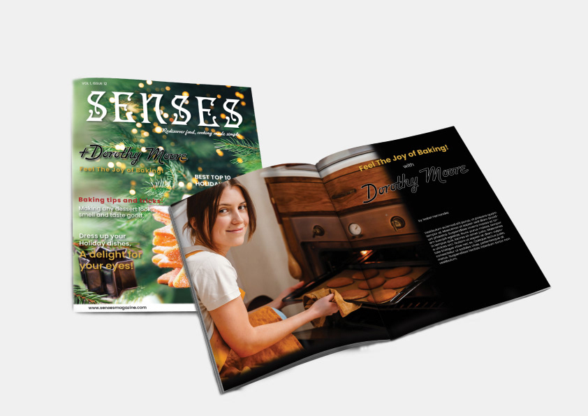
- Print, will be compose of the cover and interior article spread.
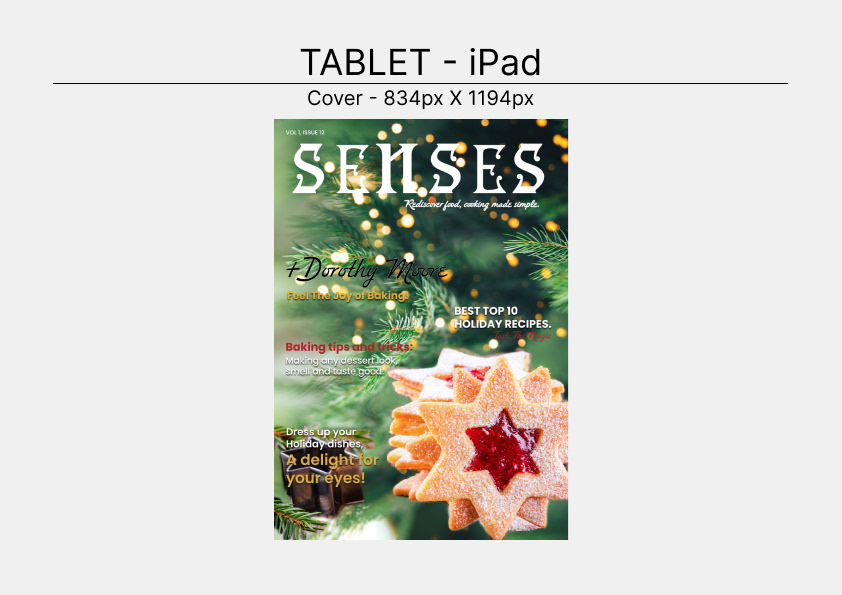
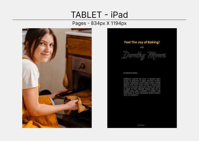
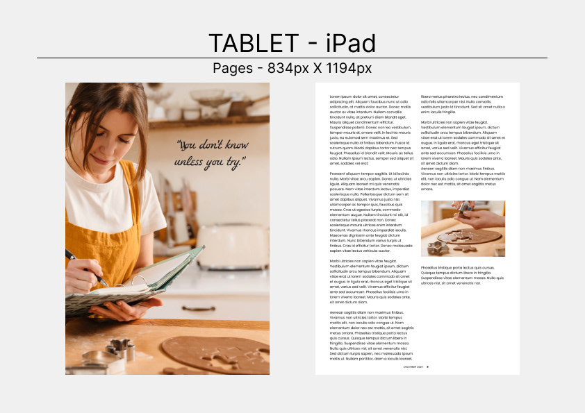
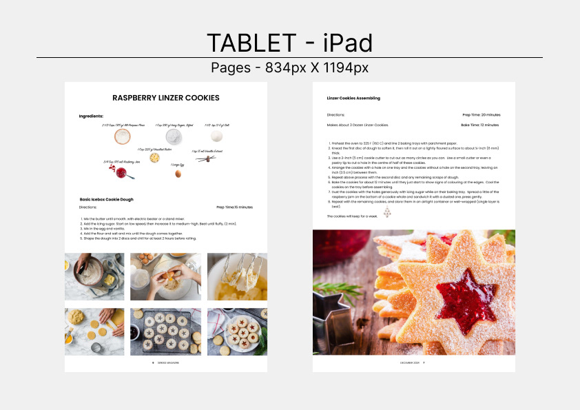
- Tablet, will be on portrait mode and compose of the cover and the article view on one page at a time.
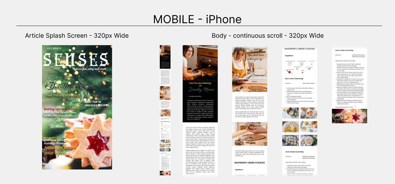
- Mobile, will show the cover and article as continuous scrolling.
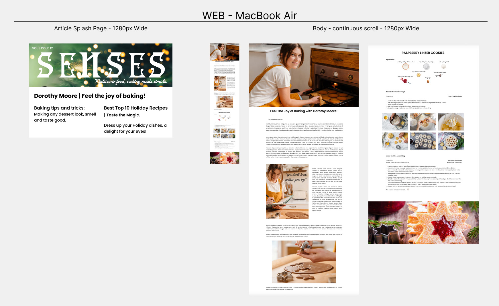
- Web, will show the cover and article as continuous scrolling.
- Select a strong typography, that reflects the brand, to be the magazine Masthead/Logo.
- Select complementary typefaces for the magazine deck, date line, volume #, issue #, lead article line, cover lines, titles, subtitles, quotes and body copy.
- Select colour palette.
- Tablet, will be on portrait mode and compose of the cover and the article view on one page at a time.
- Mobile, will show the cover and article as continuous scrolling.
- Web, will show the cover and article as continuous scrolling.
- Select a strong typography, that reflects the brand, to be the magazine Masthead/Logo.
- Select complementary typefaces for the magazine deck, date line, volume #, issue #, lead article line, cover lines, titles, subtitles, quotes and body copy.
- Select colour palette.
Target Audience
- People between 20-50 years old interested in learning about food and cooking.
- Chefs.
- Amateurs cooks.
- Food lovers.
- People that love learning new recipes.
- Chefs.
- Amateurs cooks.
- Food lovers.
- People that love learning new recipes.
Word association
Food
Desserts
Baking
Frozen
Countryside
Desserts
Baking
Frozen
Countryside
Cozy
Loving
Holidays
Recipes
Cookies
Loving
Holidays
Recipes
Cookies
Vegetables
Fruits
Tart
Fruits
Tart
Nostalgia
Magic
Friends
Family
Sharing
Magic
Friends
Family
Sharing
Enjoyment
Decorations
Good times
Warmth
Cooking techniques
Decorations
Good times
Warmth
Cooking techniques
Chef
Local
Restaurant
Local
Restaurant
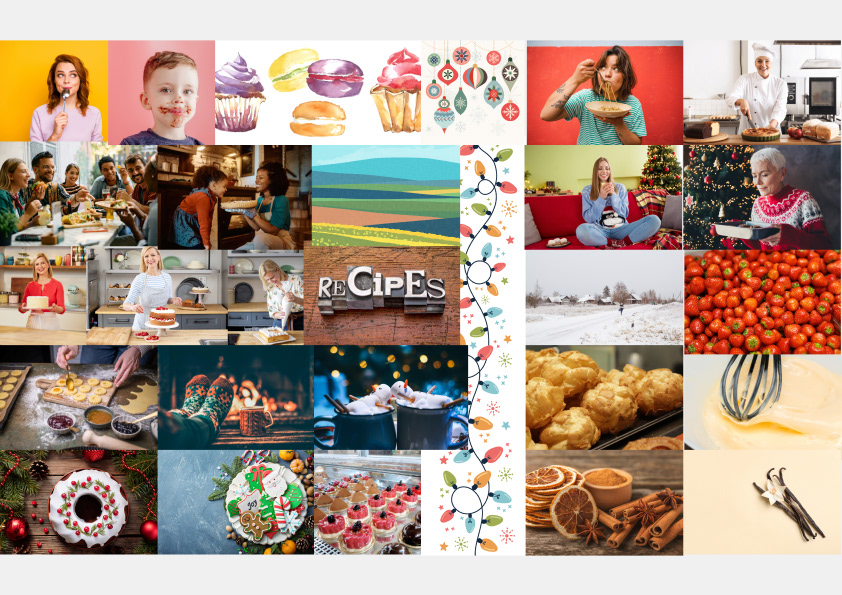
Mood board
colour Palette
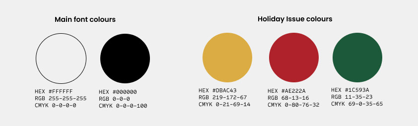
Senses magazine will use traditional white and black fonts, unless there is a specific topic running in the issue as it is the Holiday Season. The idea is for the images of different foods, chefs and restaurants to be the protagonist in every issue and for the copy to support them and provide good information on the subject.
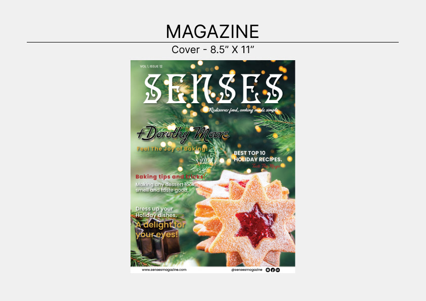
For the Holiday issue, I decided to use traditional Christmas colours, going for darker shades of green, red and gold, with complementing white and black fonts.
To improve the readability, I used drop shadows under the titles on the cover.
To improve the readability, I used drop shadows under the titles on the cover.
typography
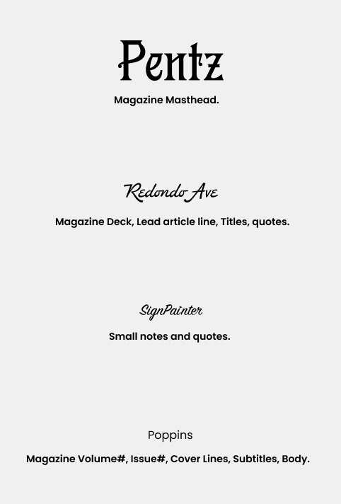
Magazine Masthead.
Pentz Classic is a font full of character that combines playfulness and functionality. It is thick and big enough to be read easily despite a busy background.
Magazine Deck, Lead article line, Titles, quotes.
Redondo Ave (Regular and Bold) is a retro-inspired, casual and modern script font, with a touch of glam. It comes in 2 weights, and adds personality to the design or layout, while remaining approachable.
Small notes and Quotes.
Sign Painter is a brush script typeface, which provides a touch of elegance and a vintage feel to the articles.
Magazine Volume#, Issue#, Cover Lines, Subtitles, Body.
Poppins is a geometric sans serif typeface with 9 different weights. It combines elegance with simplicity and it is ideal to use for large texts as it is easy to read.
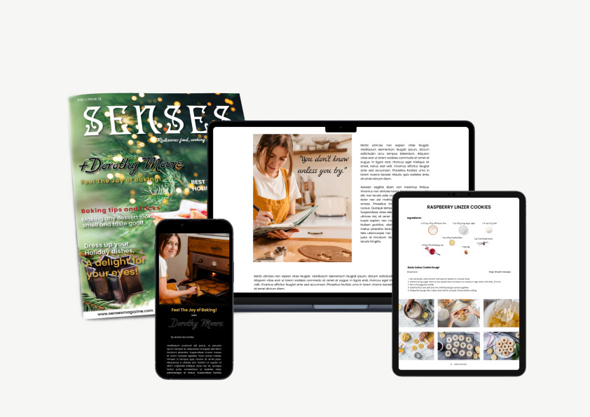
FINAL MAGAZINE DESIGN LAYOUTS
PRINT | TABLET | MOBILE | WEB
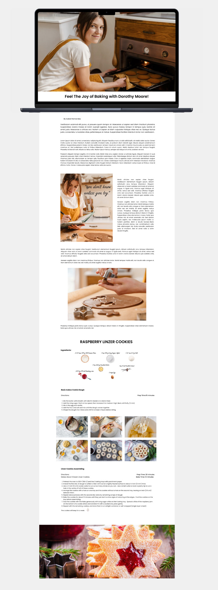
print
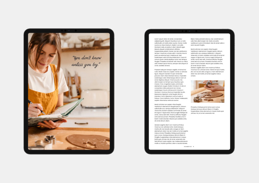
tablet
mobile & WEB
MOCK-UPS On all 4 Platforms

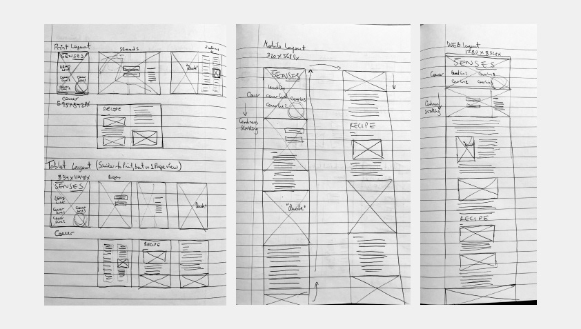
thumbnail layouts
A little glance of my creative process during the ideation stage. Rough layout sketches.