UX/UI Design | UX Research | Branding | Website | Mobile
Date: February 2024
Software | Service used: Adobe InDesign, Adobe Photoshop, Adobe Illustrator, Adobe XD, Adobe Stock.
Overview
This project had 2 stages, the research to compile the Design Document for the project and then, with the information collected, the design of the charity’s website, creating the Style guide, Wireframes and test Website using WordPress. The focus of my role was on research and UI/UX design.
Raise a forest is a fictitious BC based charity involved in the preservation of forest across BC and, in the future, Canada. They provide interactive learning spaces, through onsite workshops and online webinars, to educate people about the importance of forest in the balance of our environment.
Raise a forest is a fictitious BC based charity involved in the preservation of forest across BC and, in the future, Canada. They provide interactive learning spaces, through onsite workshops and online webinars, to educate people about the importance of forest in the balance of our environment.
The Charity is looking to re-design their website with the purpose of improving the site's traffic and increase the online donations.
design Process
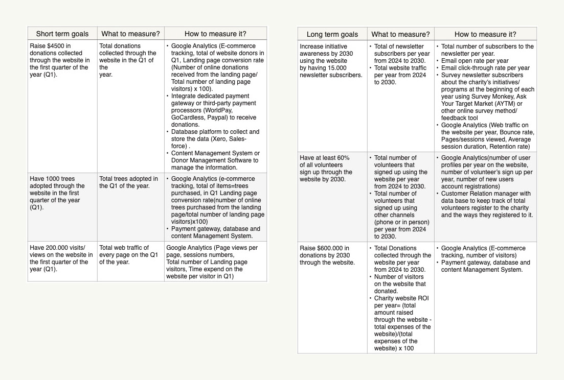
During the first part of this project, a set of short and long term measurable goals was decided as follow:
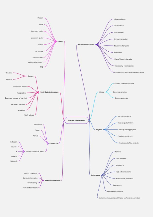
Concept map
A concept map is a great visual help to brainstorm ideas for our project.
Competitive analysis
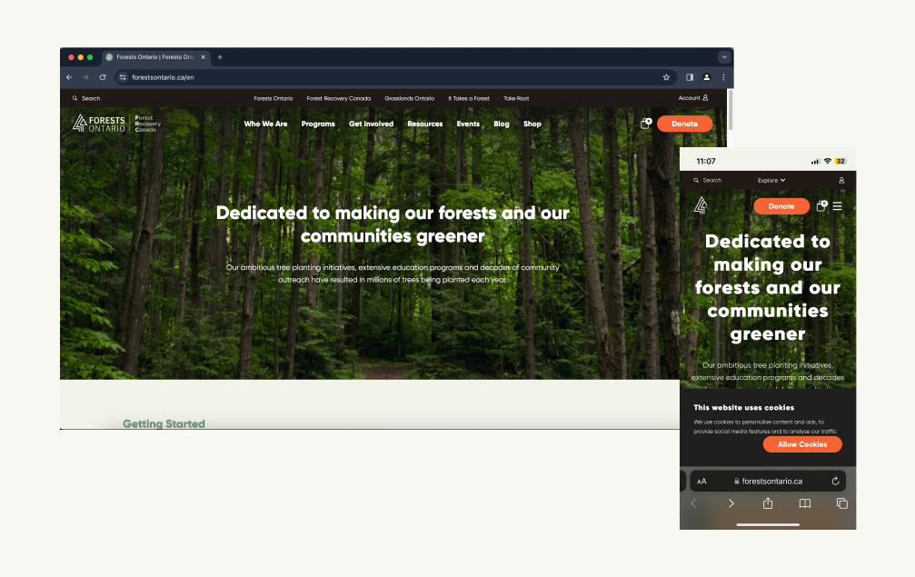
Competitor Forests Ontario, https://forestsontario.ca/en
Analysis of the website's aesthetics.
Website is functional and accessible. The user experience could be improved, but overall it is a pleasant site.
• Good hierarchy of information and navigation scheme. Website is fairly easy and intuitive to navigate.
• Easy to navigate, but it has a lot of information and , which can be a bit overwhelming at first glance. They repeat information on different pages, which makes it easy to find, but creates the feeling of too much information available.
• Users can create an account. The account button is on the top right corner of the page, but it is very small and not as easy to find as it should. The information required to create an account looks direct and simple (name, email, password)
• Search button is very small and it is on the top left side of the page, which makes finding it not intuitive.
• Newsletter sign up located on the footer, visible on all pages. Information required to subscribe is simple, Name and email.
• Direct link to all their social medias in the footer through icons. They use them to create awareness and share about their projects and learning material (Instagram, YouTube, LinkedIn, Facebook, X)
• Contact information located on the footer with email form, phones and address. This information is shown on every page.
• The site is responsive, has a good mobile viewport design.
Sense of trust, credibility and authenticity is conveyed through the website.
• Publish an annual report with quotes from volunteers and staff during events, information about their activities/projects throughout the year, statistics, expenses number, among other relevant information.
• Don’t have a section for user/volunteer reviews or testimonies, which could benefit the credibility of the charity.
• On their “Our team” page they have a good amount of information about the staff with link to a bio, phone, email form. They also have a Blog with staff information called Faces of Forests Ontario.
Good clean, modern and simple layout design, with according color palette.
• The typeface used on the website, could be improved as it is a bit blurry in some instances and a bit hard to read for longer paragraphs.
• They have a good amount of images to express their mission and their commitment. Event’s pictures also enhance their credibility and authenticity.
• Labeling system is easy to understand, constant and organize. The Shop (conference tickets, donate, membership options) and account (Log in/sign up) label do not convey the full meaning of the options they carry, it can be confusing for the user.
• They use complementary colour to enhance call to action buttons (orange), as donate and sign up for newsletter. Lacking in the account (sign up/log in) button. They should emphasize the links and menu buttons in a more noticeable way (changing size or colour of text for example)
• Text is well divided in small paragraphs and are easy to understand.
• The tone and copy is professional, serious and informative, creating the feeling of expertise and trust in the charity.
• Color palette consists on tone of greens and white, with accents of black and orange.
Great educational content about forests is provided on the website.
• Educational information is available throughout the site in form of articles. The articles and reports are well made with a professional, but approachable tone. They also have reference sections to back the sources of the information used.
• Information is also shared using social media channels mainly videos on YouTube.
Third Party Analysis
The website has very good accessibility and SEO score, which makes for a good user experience. It also has Google Analytics and Google Tag manager in all pages, which allows for analysis of visitor’s behaviour. They also have meta description set up in all pages, allowing search engines to show this text in search result pages. Regarding the performance and security of the website the analysis shows that it can be greatly improve., mainly their page speed (8.3sec) by reducing the page size and the HTTP requests the website makes.
Performance details
• Page size is 7 MB (Optimal size < 3MB.
• 114 page requests (optimal <30).
• Page speed is 8.2 sec (optimal speed < 5.3 sec).
• Minified Javascript not properly compressed.
• Browser caching (storing frequently used content in local memory).
• Minimal page redirects (only 1) .
• Responsive images or SVGs for optimized image sizing.
• Minified CSS properly compressed.
SEO details
• The website drives organic traffic.
• Permission to index is granted for search engines.
• No content plugins.
• Meta descriptions.
• No descriptive link text used. (it has “Click here” for links, so users don’t really know where the link will take them and it also don’t allow for search engines to understand your content fully)
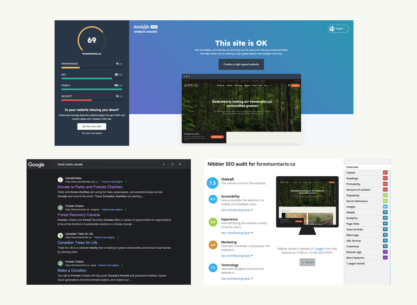
Security details
• The website is equipped with an SSL certificate
• Free from vulnerabilities.
• It is secured with HTTPS, which protects from attacks and give visitors confidence that the site is authentic and trustworthy.
• It has outdated JavaScript libraries, which is a risk as can be exploit by intruders.
Accessibility/Mobile details
• 100% of the pages has defined titles (good for SEO).
• All URLs are well written.
• Internal links are well defined (good for SEO/accessibility).
• Optimized for viewing on mobile phone or tablet, with legible font size (at least 12px), tap targets (interactive elements are big enough and separated one from another) and responsive design.
• Contrast between the background and foreground colours is not enough, which may cause issues for some users while reading the text.
Experience/User satisfaction details
• Good number of monthly visits (1948 estimated monthly organic visitors)
• Recently updated, on January 31, 2024, which enhance the credibility of the website and it is spidered by search engines more often.
• Images on the website have defined sized, which allows the browser to arrange the page more quickly,.
• Twitter account is not linked to the website.
• Pages are not optimized for printing.
• Bots cannot find the content as the website mostly has images not text, which impacts the SEO score and the probability of the site to be found.
• Has the ‘404 error HTTP status code’
• Has GZIP encoding that reduce loading time,.
• Uses a permanent ‘HTTP 301’ redirect from http://www.forestsontario.ca to http://forestsontario.ca.
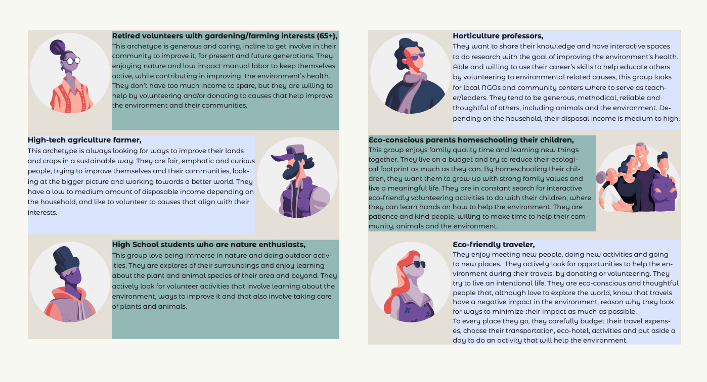
Archetypes
I defined the archetypes of the target audience for the charities website. Defining the archetypes, helps me design with a narrow group of users in mind that will have certain needs and expectations of the website and its features.
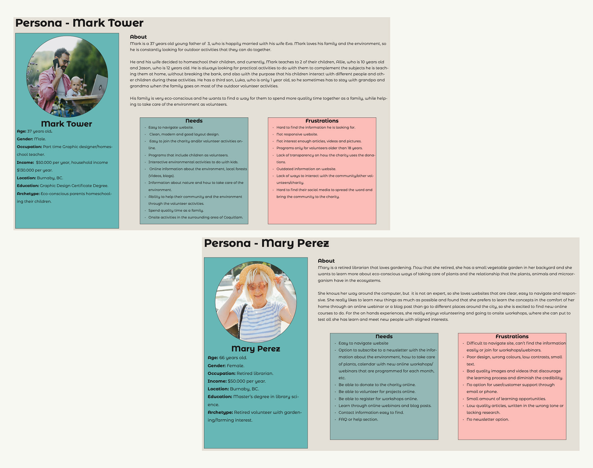
Persona
I created 2 personas based on the pre-defined archetypes to empathize with the users. Having a Persona in mind while designing is really useful to create with a particular user in mind that will have real problems that can be solved using the website's features. It helps me empathize with the users needs and frustrations, looking for optimal solutions that address them.
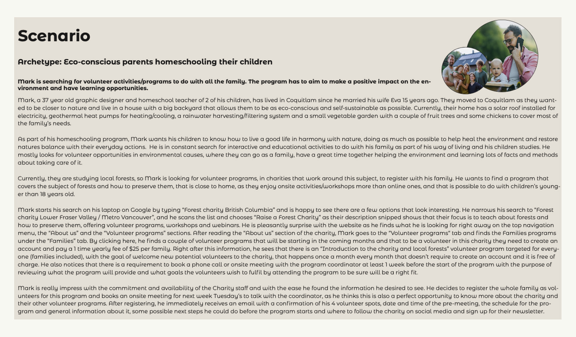
SCENARIO
Creating scenarios, is the next step to strengthen the connection with the users of our website. Going through a scenario while designing, helps us prioritize information and features, making the design decision process more fluid.
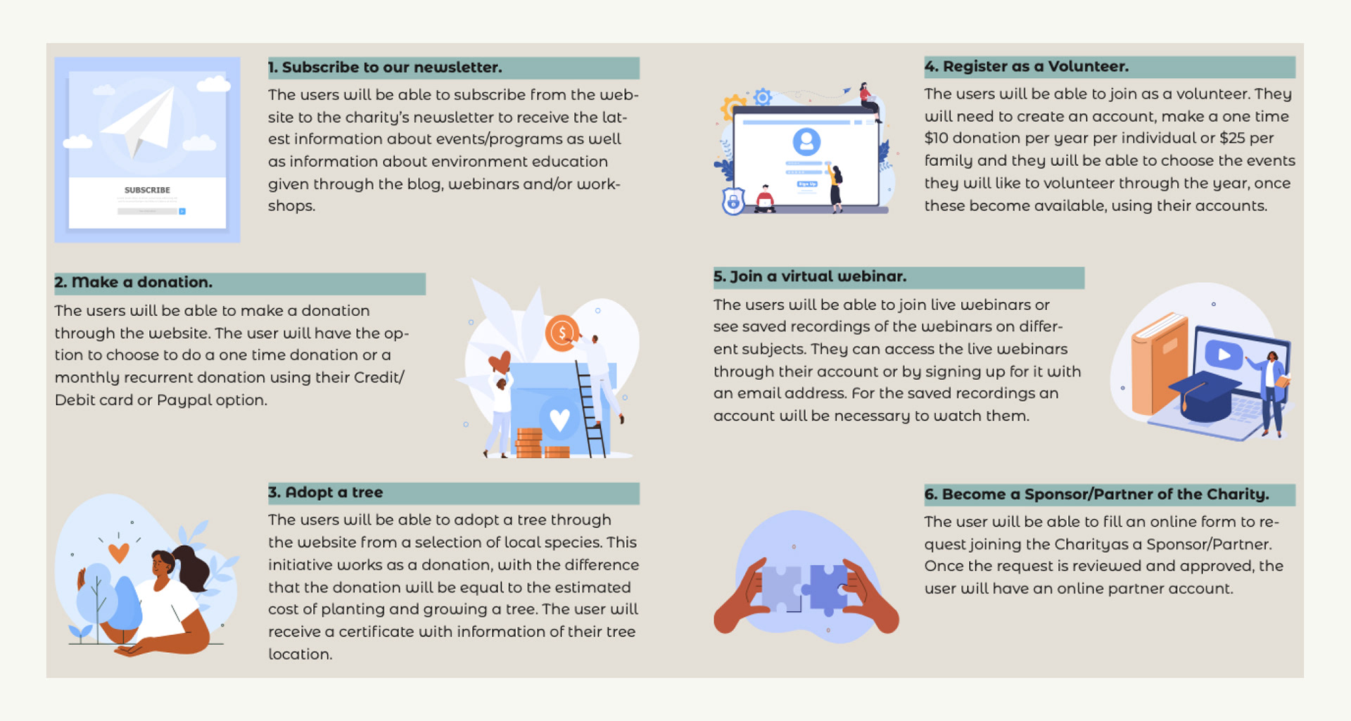
Tasks
Defining the main tasks users might do on the website helps to focus our efforts in the correct design and development path.
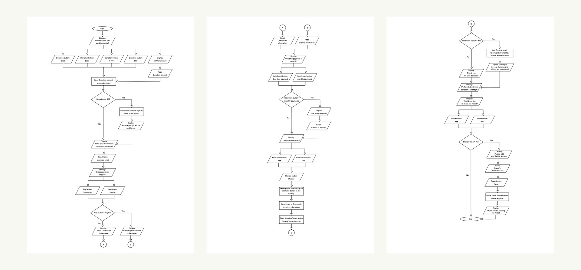
Flow chart - User donation process
The creation of a flow chart for the tasks is an excellent way to visualize the whole process a user will do in our website to be certain that it flows and do not have dead ends that would trap the user. It is recommended to create them for every task. For this project, I created only the flow chart for the donation task due to time and resource constrains.
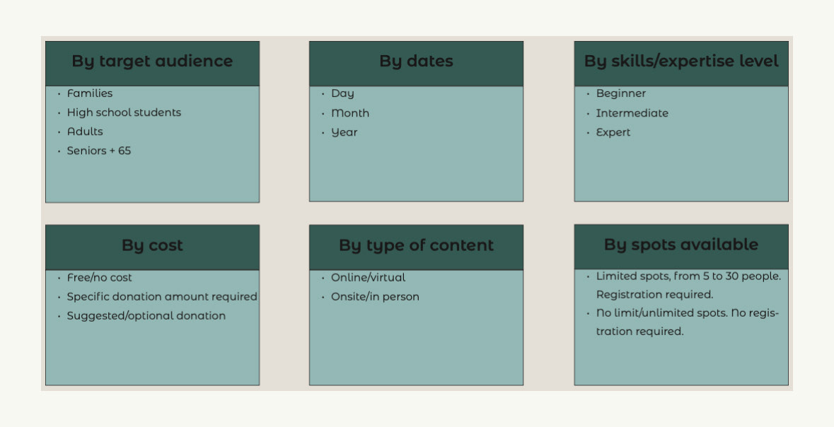
Facets
Some areas of the charity can be categorized based on common attributes into facets to improve the navigation of the website. The following can be good facets to have for the workshops, webinars and volunteer programs/activities.
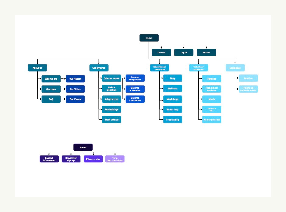
sitemap
The sitemap show us a quick visual representation of the website's content. It is useful for the planning of a new website or a redesign process, for Search Engine Optimization (SEO), for the user's navigation and to increase the website's accesibility.
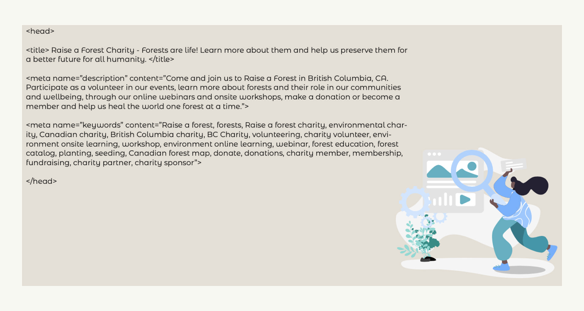
SEO meta data
By using SEO correctly on our website, we can help search engines (like Google) understand and capture the website's content, knowing what pages are important, when was the content updated and other important information that helps our users find the site easily and decide if the website will provide them with the information they are looking for.
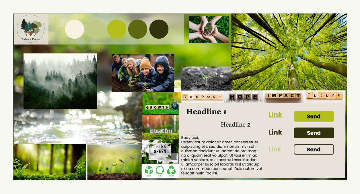
Style guide
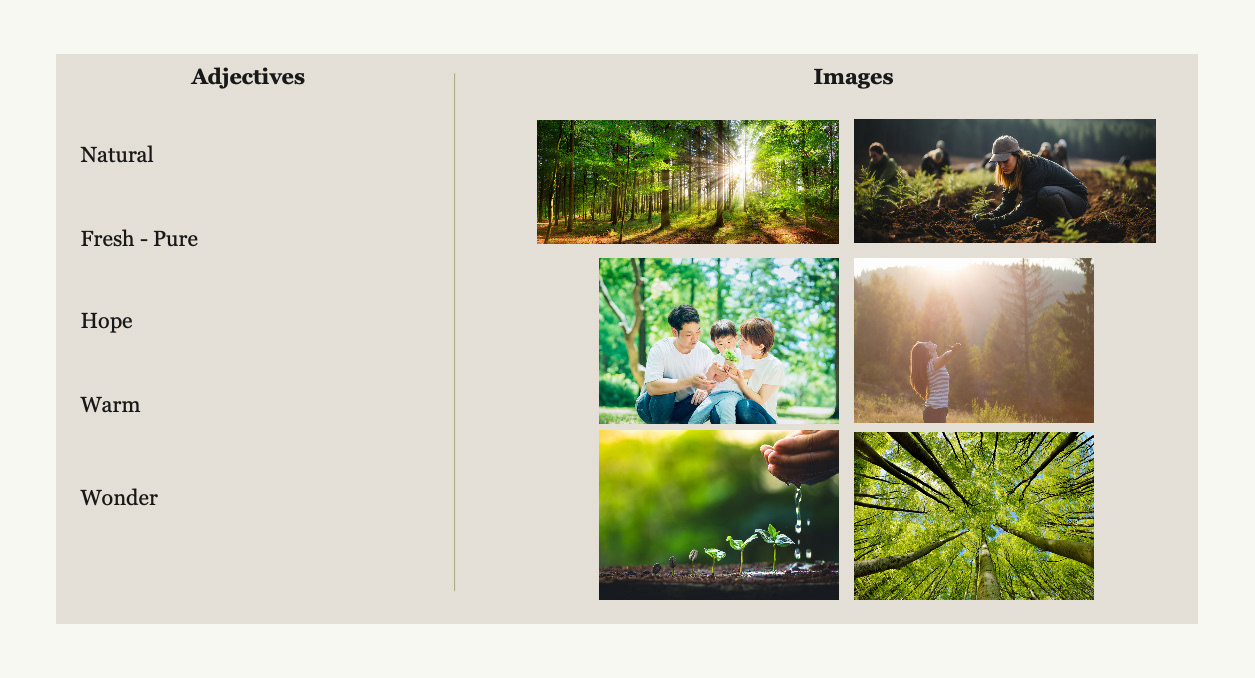
I first created a Style tile, which provides a visual design document conveying the website's visual style at a glance. For Raise a Forest website's, I wanted to portray mainly a fresh, natural and clean look.
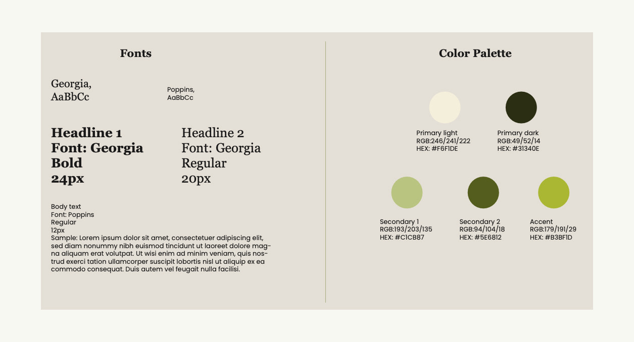
Colour palette and typography
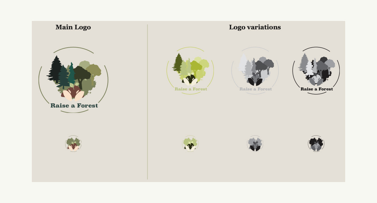
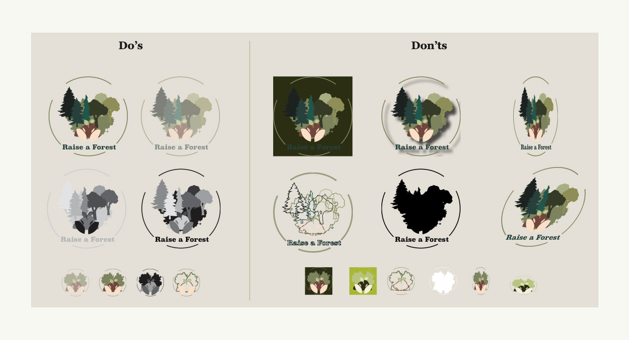
Logo design
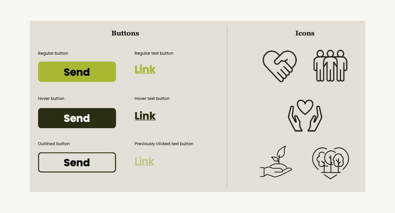
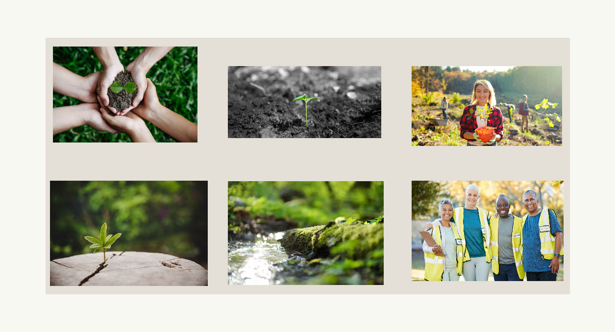
Assets | Icons | Images
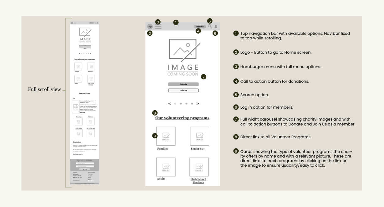
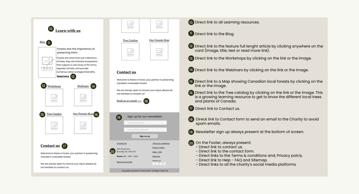
Wireframes | Mobile
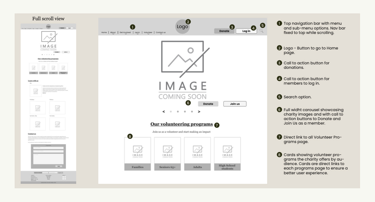
Home Screen
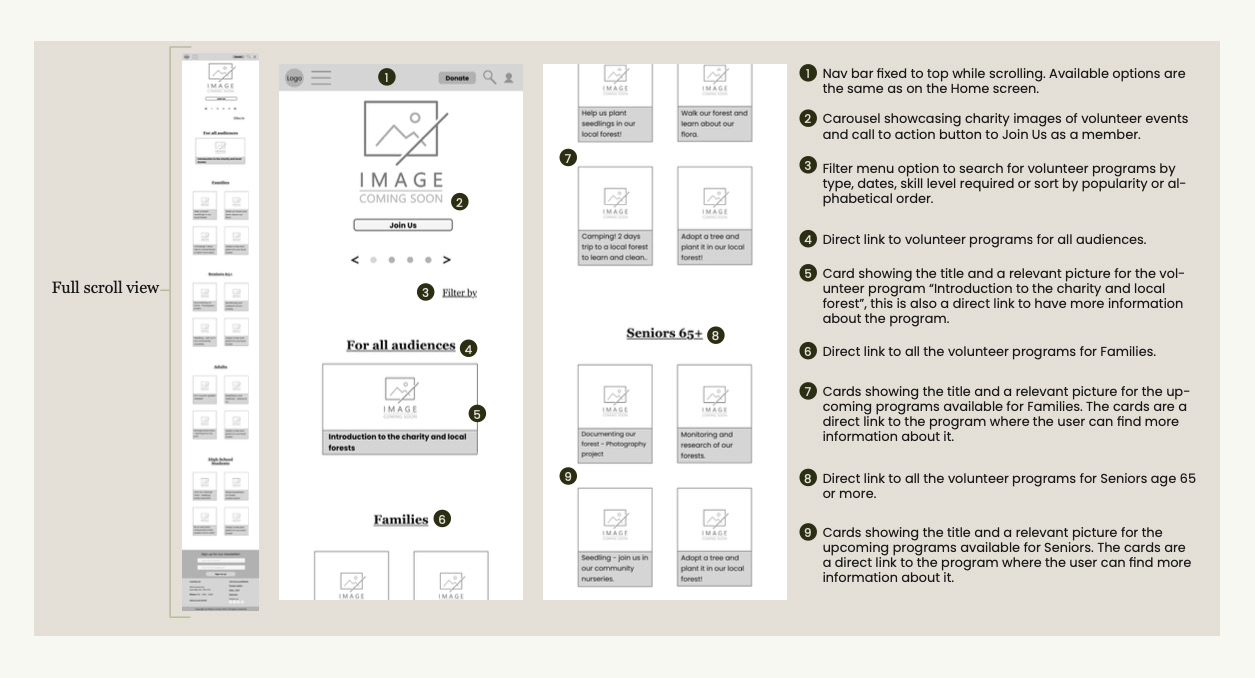
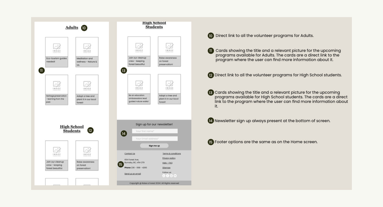
Volunteer Screen
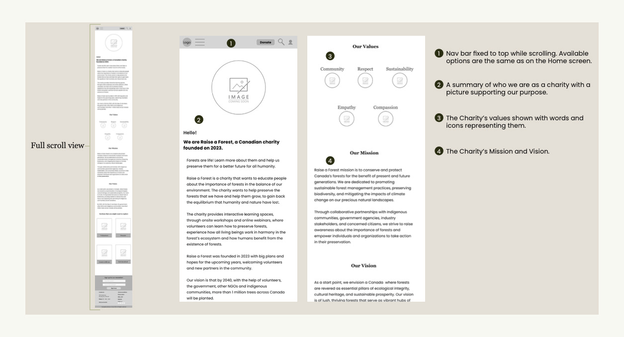
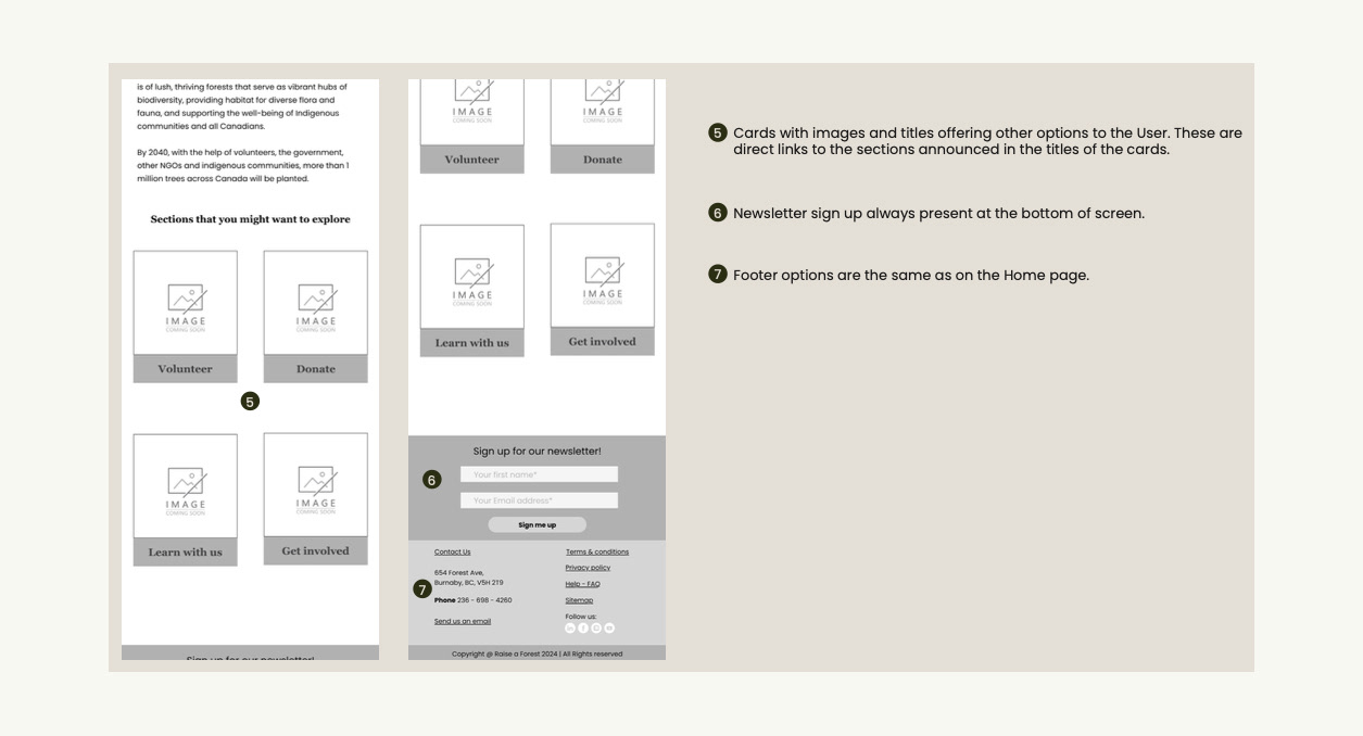
About Screen
wireframes | Web
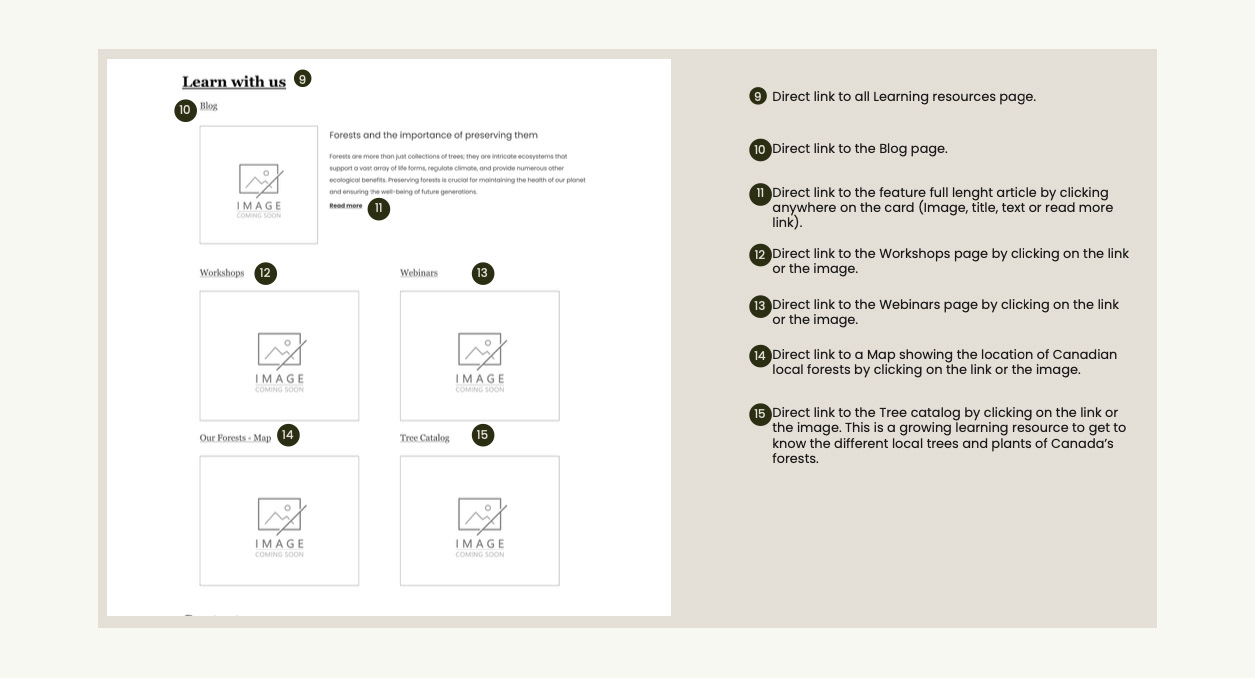
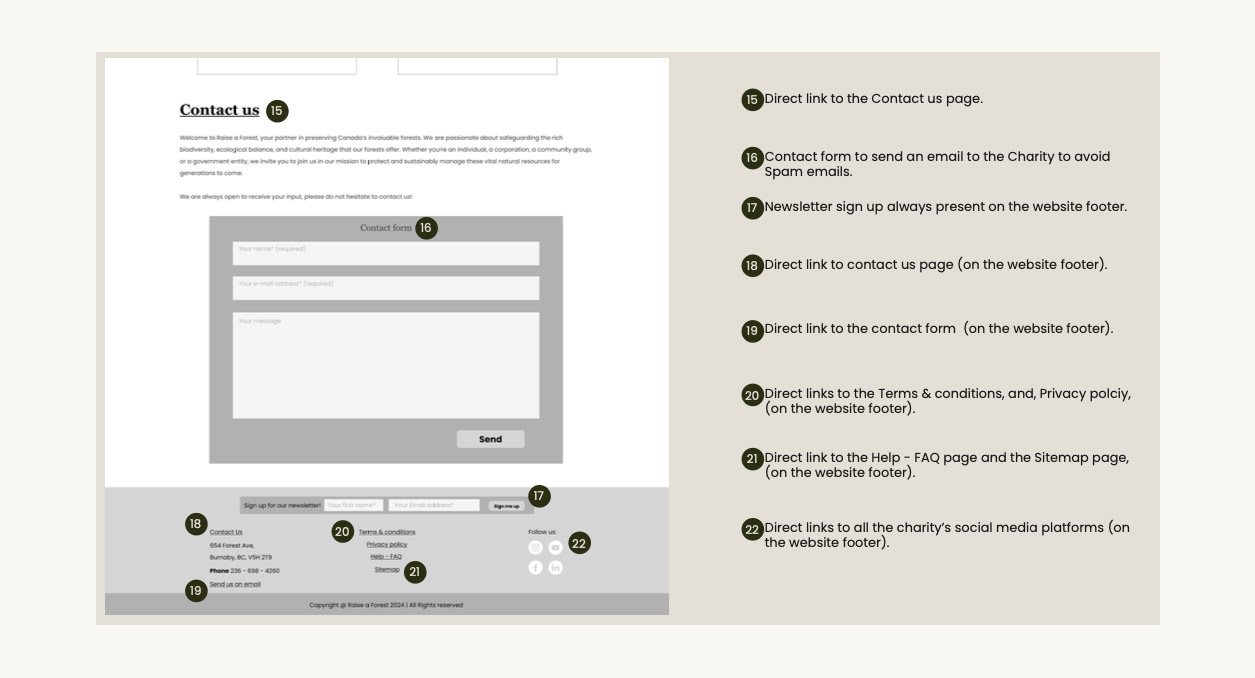
Home Page
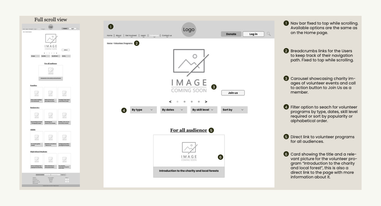
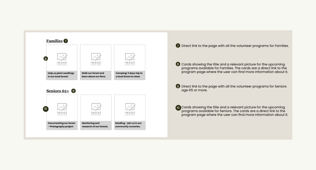
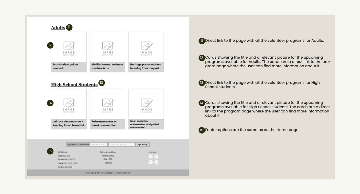
Volunteer Page
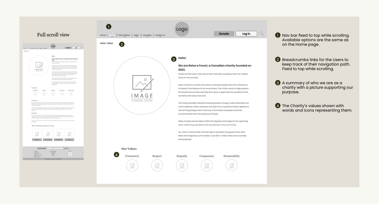
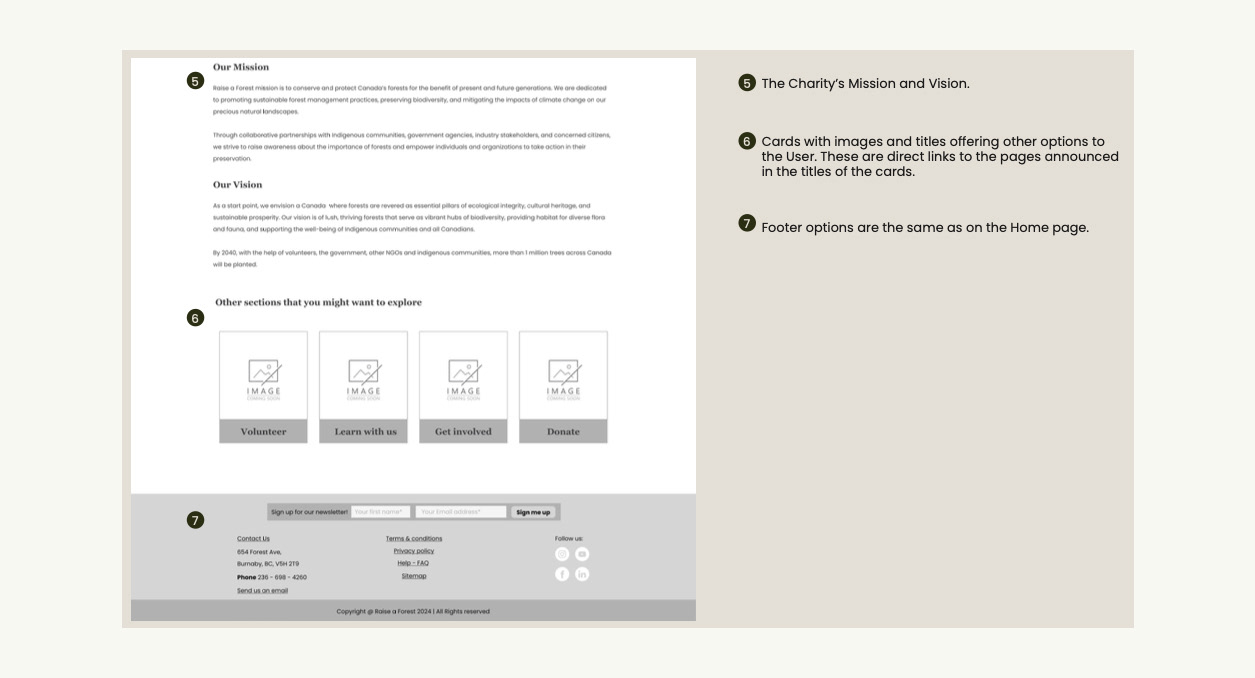
About Page
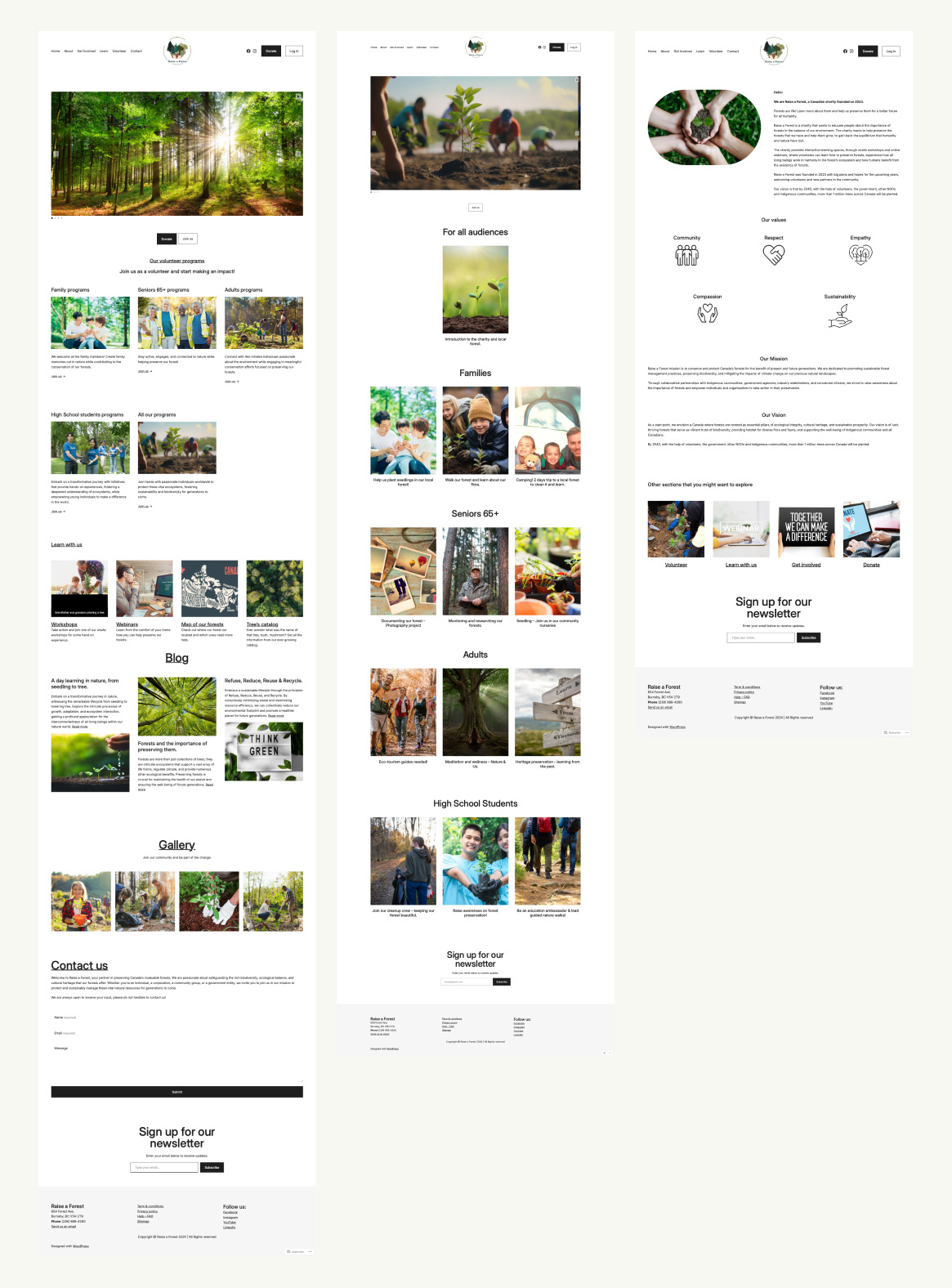
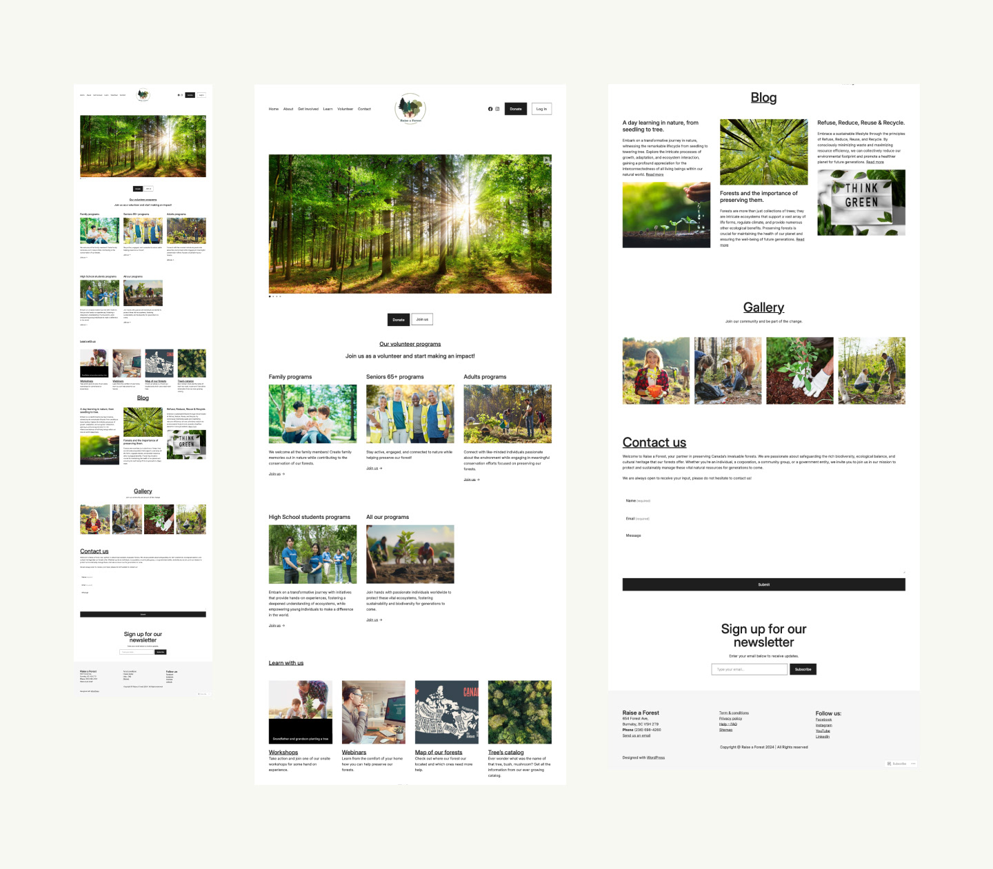
Raise a forest Concept website
Using Wordpress I created a similar website as close to my design as possible.
Raise a Forest Website's Pilot