Branding and Digital Marketing | Digital and Traditional Ads | Logo
Date: October 2024
Software | Service used: Adobe Illustrator, Adobe InDesign, Adobe Photoshop, Adobe Stock, Procreate, Figma.
Overview
This project is based on a local Ice Cream Shop that is looking to re-brand itself and their services to attract new customers in the age range 18-35 years old. The shop is known for their handmade ice cream made with local products and cozy environment.
My role on this project was to develop a basic brand package with 3 typographic based ads and social presence for the ice cream shop to promote their services to their new potential audience. The focus of my role was on research, branding and graphic designer.
My role on this project was to develop a basic brand package with 3 typographic based ads and social presence for the ice cream shop to promote their services to their new potential audience. The focus of my role was on research, branding and graphic designer.
Deliverables for this project included a basic digital marketing package with 1 digital Street Ad and 2 social digital Ads on instagram, 1 post and 1 story, social brand presence (profile photo and banner), logo, colour palette and typography.
Project goals
1. Create a new logo that reflects the brand personality (Cozy, happy, vintage and nostalgic) and product.
2. Select the colour palette specifying the primary and secondary colours to use to reinforce brand recognition.
3. Select the typography for the headlines, tagline and body.
4. Create a harmonious image bank reflecting a vintage appearance.
5. Design 1 Digital Ad and 2 social media Ads to promote the new services offered by the Ice cream shop, Catering/events and Online delivery, and their message to attract more customers.
6. Design the social brand presence (Profile picture and banner).
Design Process
The process I followed in this project is based on the 5 phases of the Design Thinking process (Empathize, Define, Ideate, Prototype and Test).
My action plan was as follow:
- Learn about the Ice Cream Shop. Their purpose, values and vision of their business.
- Research some of the local competitors looking for clues of what is working and what can be improved.
- Brainstorm concepts and ideas to start the design process of choosing the colour palette, typography and the design of the Logo.
- Ideate and iterate with various layout designs for the different type of Ads.
- Create the final Ad pieces following the defined brand guidelines.
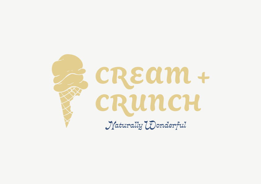
About Cream + Crunch
CREAM + CRUNCH is an ice cream shop known for their creamy handmade ice cream and wonderful flavours.
They are located in Vancouver in the neighbourhood of Kitsilano, near the Kits Beach, and their customers are mostly seniors and families with young children.
Founded in 2014 by 2 sisters, Isabella and Elvira, CREAM + CRUNCH has withstand the test of time and it is a big part of the community. They proud themselves of their high quality local products and excellent customer service.
They also are very involved with the local community, joining several activities during the year and supporting local farmers and other sustainable companies for all their biodegradable inputs. Their big environmental goal is to be Zero Waste by 2030.
Core Purpose
To bring joy to the world by sharing delicious and natural ice cream flavours in a sustainable way.
Business Goals
- Improve our local community (events/charities).
- Positive environmental impact (zero waste/organic utensils).
- Create spaces to share in family.
- Be the number one choice for our customers.
- Provide the best ice creams in town.
- Positive environmental impact (zero waste/organic utensils).
- Create spaces to share in family.
- Be the number one choice for our customers.
- Provide the best ice creams in town.
Value Proposition
We our proud to provide the best quality ice cream, made from organic and local ingredients, in a cozy and friendly environment, where all are welcome, and our customers feel like home. Our environmental friendly and customer focus policies keep us on track to reach our goals and keep providing the best ice cream experiences to our clientele.
Core Values
- Be kind/mindful/thoughtful.
- Be honest/ethical.
- Be Eco-friendly/sustainable.
- Local first.
- Be honest/ethical.
- Be Eco-friendly/sustainable.
- Local first.
Brand Voice
- Listen, think, act.
- Kind and warm tone.
- Customer focus.
- Kind and warm tone.
- Customer focus.
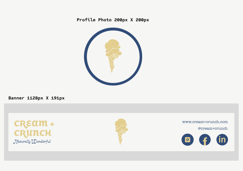
Brand Name (URL & Socials)
- CREAM + CRUNCH
- www.cream+crunch.com
- @cream+crunch
- www.cream+crunch.com
- @cream+crunch
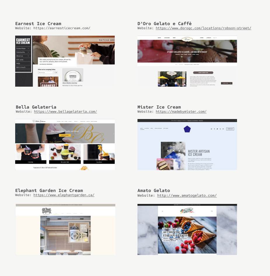
competitive analisys
I did a light research of the main competitors in the Greater Vancouver Area with the aim of getting to know the competition, their branding and marketing approach.
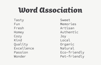
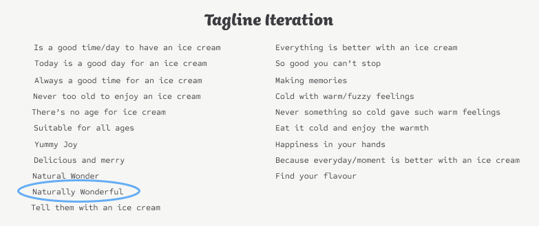
Word association and tagline iteration
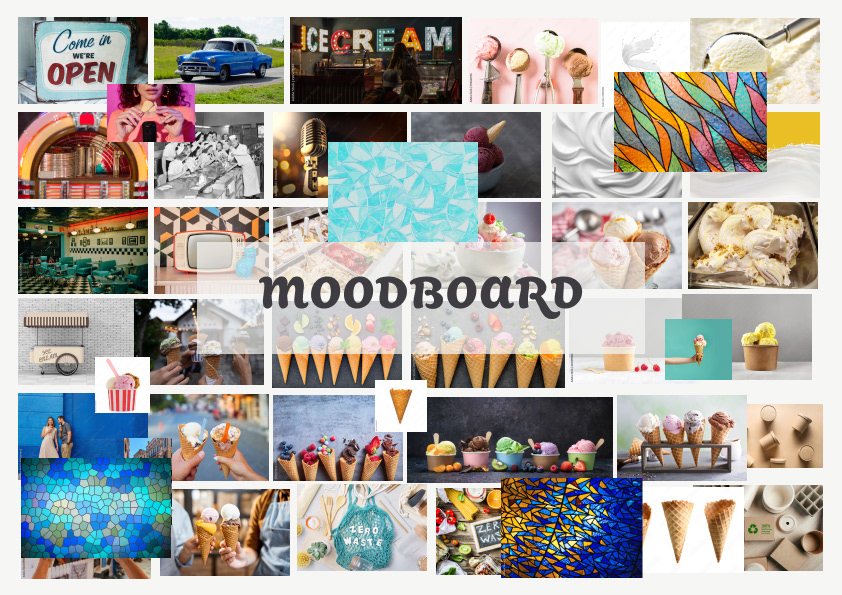
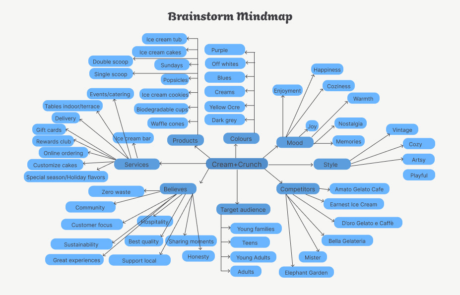
Mind map and Mood board
I find these two tools very useful to spark ideas and have everyone on the same page regarding the vision of the design.
Colour Palette
Primary Colours
For Cream + Crunch’s primary colours, I decided to emphasize the vintage and cozy feel of the brand using a very soft yellow-ochre (#E3CE8F) and an off-white, light greyish yellow (#F6F6F4) in contrast with a dark moderate blue (#304C78), choosing muted tones to make the brand feel more modern and sophisticated without loosing its vintage and playful appeal. When choosing the colours, I also kept in mind to evoke nostalgic for the current branding.
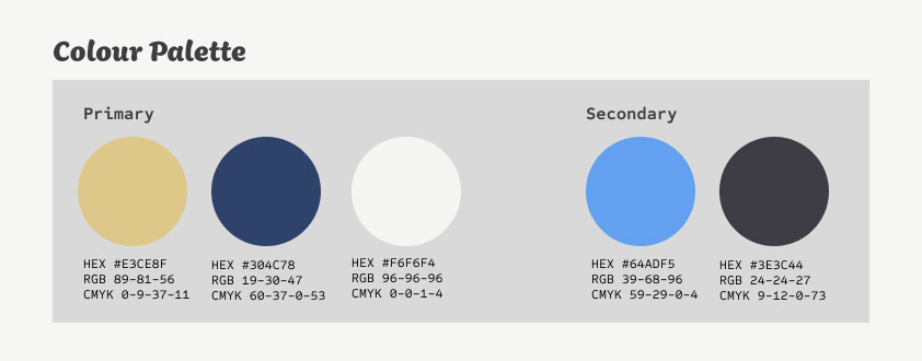
Secondary Colours
The 2 secondary colours are used as accents, when needed, keeping in line with the blue tones, I chose a soft blue (#64ADF5) for light accents and a deep dark greyish blue (#3E3C44) mostly to be use for copy and dark backgrounds.
Typography
Headlines
Aisha Latin is used for the main titles. This typeface has dynamic curves and notes of visual interest that reflects the fun, vintage and cozy sentiments that the brand wants to keep portraying. I also chose it as spite its artsy look, it is still fairly easy to read in titles and subtitles.
Body
On the same line of thought, for the body copy the typeface used is American Typewriter, to emphasize on the nostalgic and vintage feeling while conserving a good readability thanks to its proportional design.
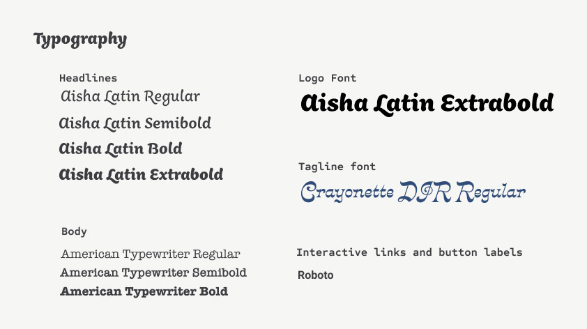
Logo Font
Aisha Latin Extra-bold in all capital letters is the font used in the logo.
Tagline font
Crayonette DJR is the font used in the Tagline to give a note of quirkiness to the brand.
Interactive links and button labels
Roboto regular family is used in the interactive text and items to reinforce the different between these and the copy. Roboto is a neo-grotesque sans-serif typeface family available for Web and Mobile, and it is also suitable for print. It has a simple, geometric and friendly design.
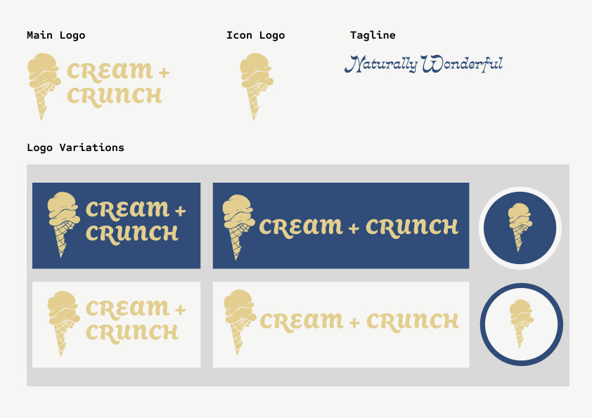
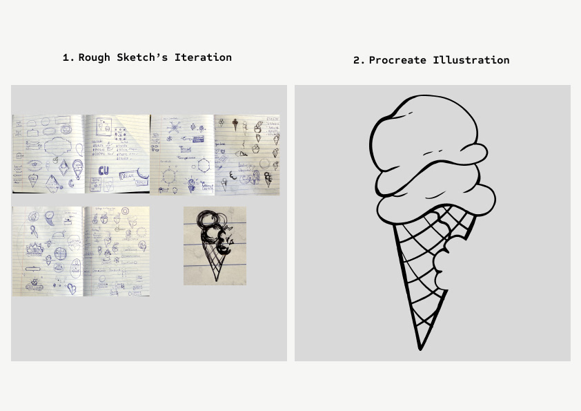
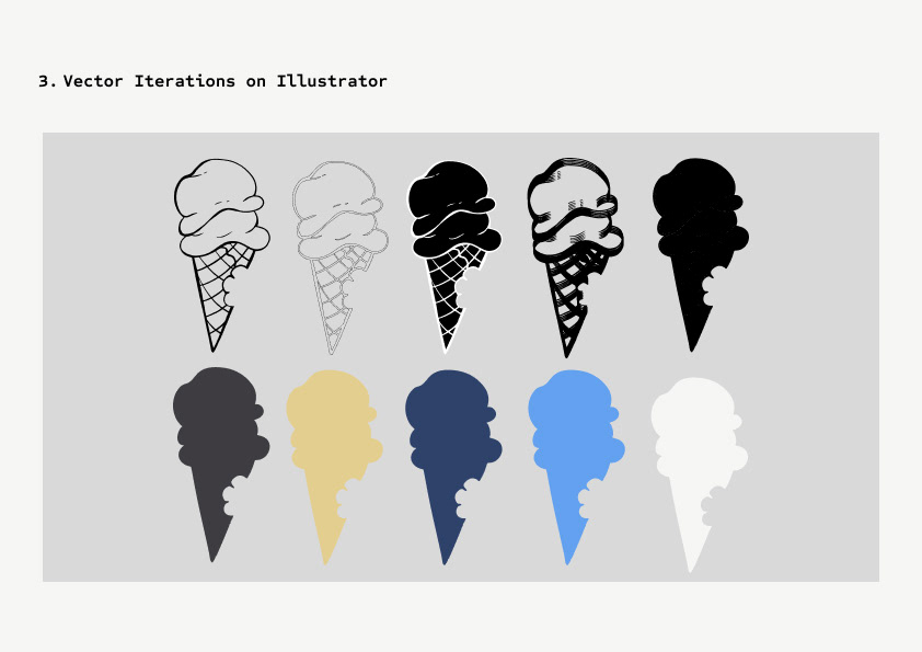
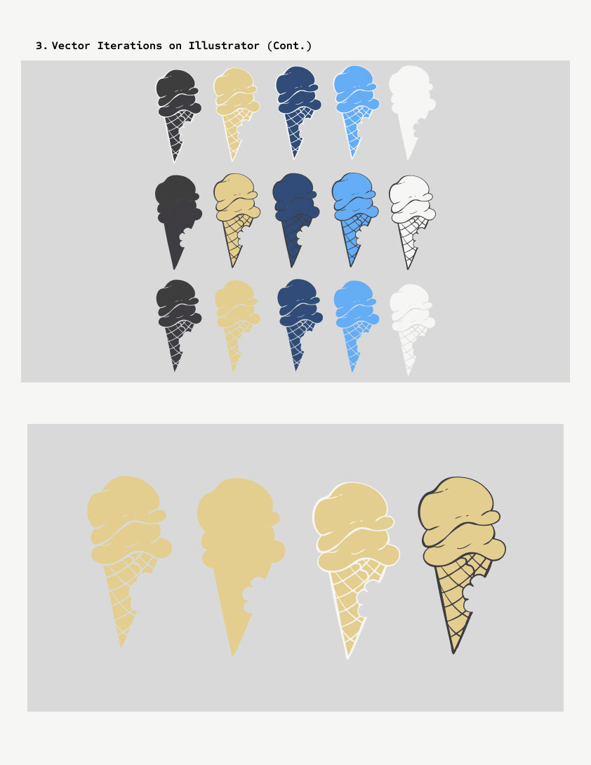
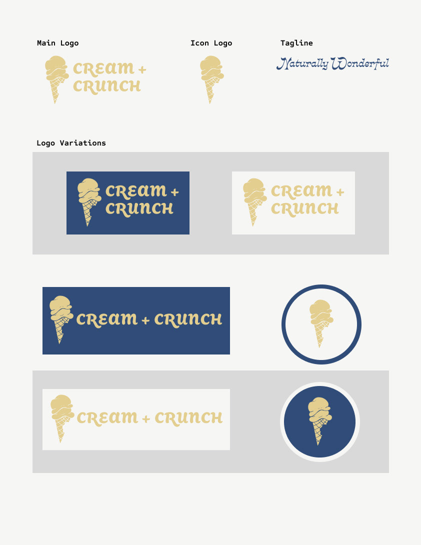
Logo design process
Once the brand was defined, I proceeded to design the logo through the following steps:
1. Rough sketches
2. Illustration of the design selected from the sketches made in Procreate.
3. Vector of the illustration in Illustrator and iteration of the base design and its colour from the brand's colour palette.
4. Final main logo, icon logo and tagline with different logo variations.
Social Brand Presence
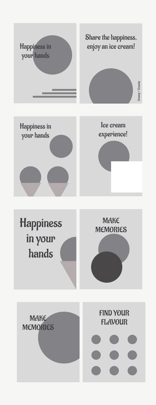
Layout Design
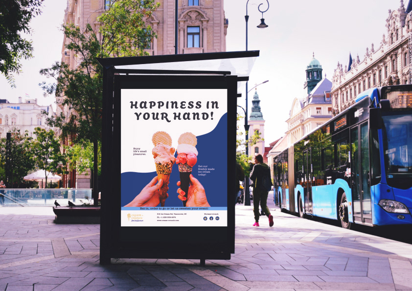
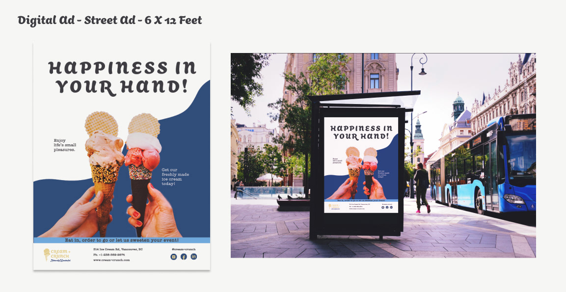
Digital Ad
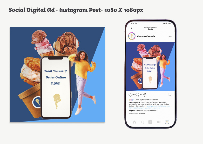
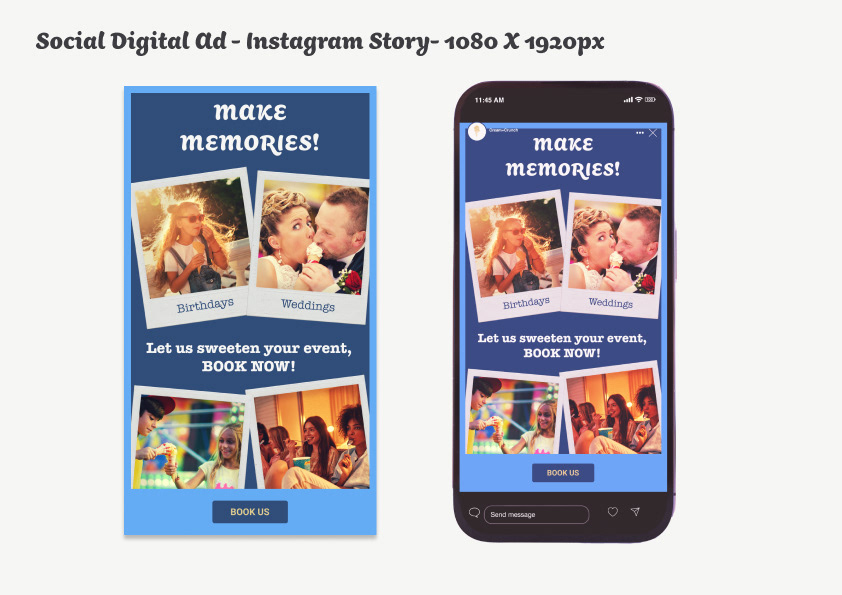
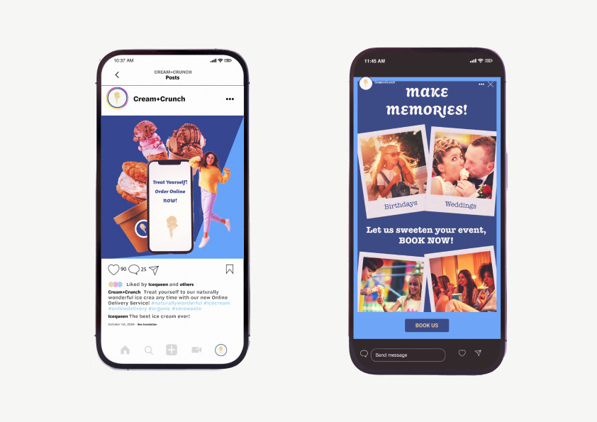
Social Digital Ad
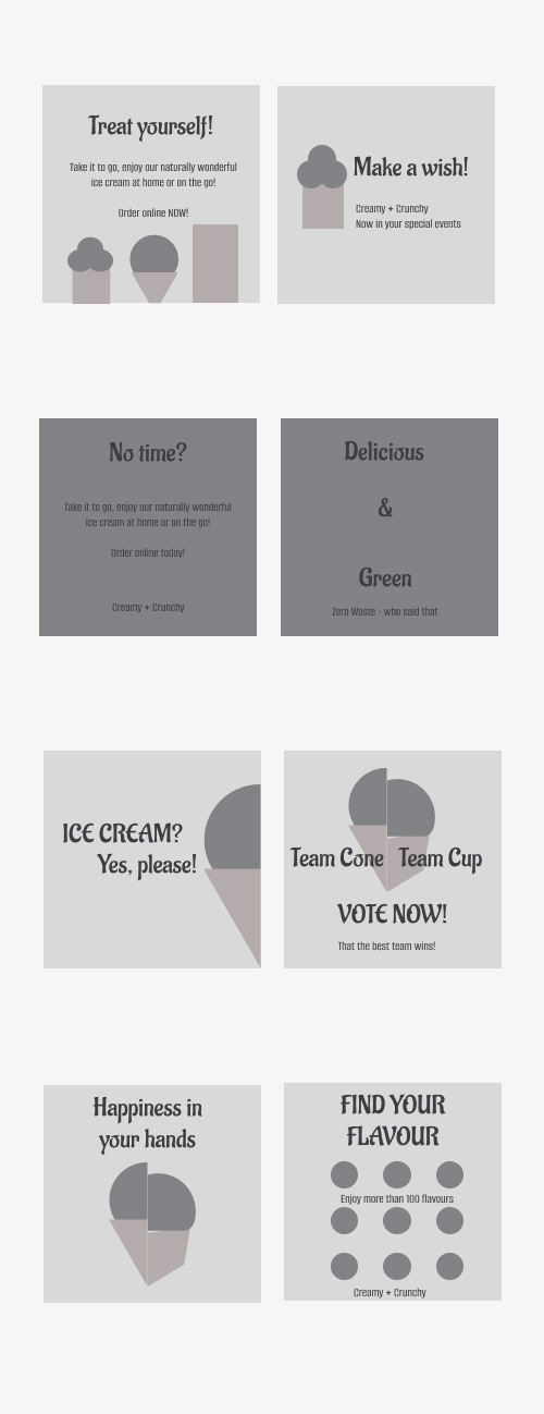
Digital Ad
Social digital Ad for Instagram