UI/UX Design | Case Study
Date: November 2024
Software | Service used: Figma, Adobe Illustrator.
Overview
In this design study I analyzed the current website of Burnaby Neighbourhood House (BNH) - https://burnabynh.ca - and I re-designed some aspects of its UI styling and improved its UX to optimize and enhance the front end, refreshing the design elements, optimizing the layout and removing redundancies from the Home page, main Menu, Volunteer page, Donate page and Contact page.
As BNH works with all kind of people, of different age, culture, background, etc, currently its website is overwhelming and the information is shown in many ways, but in a disorganized manner, as they want to be accessible for as many of their audiences as possible.
My approach will be to tackle the main 4 pages of the website focusing in:
Providing a clear hierarchy of information.
Having clear and visible Call To Actions.
Having a balance between showing relevant information and letting the user open additional information only if required, to avoid information overwhelm and scroll fatigue.
To sum it up: my mindset will be to use a “less is more - keep it simple” approach, focusing on Mobile First.
design process
About Burnaby Neighbourhood House - BNH
The Burnaby Neighbourhood House - BNH, was the first Neighbourhood House to be Established in Burnaby. It is a charitable, volunteer driven, non-profit organization that aims to build a strong community in Burnaby, by providing programs, services and support to individuals and families, in response to identified community needs. It is a place in the community that provides a warm and welcoming environment for new immigrants, seniors and youth to gather, in events that bring together diverse generations, cultures and backgrounds.
They want to make Burnaby neighbourhood a better place to live by enabling people to enhance their lives and strengthen their community through innovative programs and services that meet the changing needs of a diverse population.
They want to make Burnaby neighbourhood a better place to live by enabling people to enhance their lives and strengthen their community through innovative programs and services that meet the changing needs of a diverse population.
burnaby NEIGHBOURHOOD house | Website Analysis
Positives
- Good amount of information on the Home page, avoiding scrolling fatigue.
- Good URLs concise and clear.
- Breadcrumbs used, although a bit hide under the main titles.
- Clear typeface for headlines and body, although it is almost the same that is used for links causing doubt to which is or not a link.
- Good URLs concise and clear.
- Breadcrumbs used, although a bit hide under the main titles.
- Clear typeface for headlines and body, although it is almost the same that is used for links causing doubt to which is or not a link.
Negatives
- Slow loading time. It takes quite a bit for every page to load.
- There is not a clear hierarchy in the Home page.
- Website is not fully responsive.
- Too many menu options.
- Repeat information - like values, donate button and link - get involved button same as volunteer link, which can cause confusion.
- Inconsistency of the style of links throughout the website.
- Outdated style of some of the links.
- Not following the brand colours for some items, like links, buttons, accents, specially in the green colour. They used several different shades of blues, greens, greys, black and white. Not matching the logo colours 100%.
- Colour is used throughout the website a bit randomly, with specific purpose to give importance and make the website feel like part of the brand.
- Languages links don’t offer the website in a different language but take you to the “Newcomers Services” sub-page in the specified language, which is misleading.
- There is redundancy of contact information on the sub-menu tab and at the bottom of home page -
-By clicking on the Contact menu item, it takes you to an email form, but to see the information on the different locations, it is through clicking on a small link, “Services locations ”, on the sub-menu.
- Inconsistency on the menu items, some lead you to another page, some doesn’t do anything.
- Social media on the footer and on the contact link
-Images are inconsistent in style and tone and most are pixelated, giving an unprofessional look and feel to the website.
Focus of the design study and improvements to achieve.
Due to the scope and resources for this Design Study, I decided to focus on the below areas to improve on this iteration. The re-design will be applied on the Home page, Volunteer page, Donate page and Contact page. I will also implement some changed on the Navigation menu, sub-menu and Footer.
- Design the pages to be fully responsive, ensuring a smooth transition between Web and Mobile experience.
- Establish a clear hierarchy of information.
- Place visible and clear Call To Action (CTA).
- Remove redundancies of buttons, links and information.
- Establish clear and uniform labels for buttons, menu items and links.
- Add secondary typeface to have a clear distinction between links and headings/body copy.
- Use only the brand colours on the website, keeping them constant throughout it.
- Use clean, simple and inviting design.
- Display the information in an organize and bite-size manner.
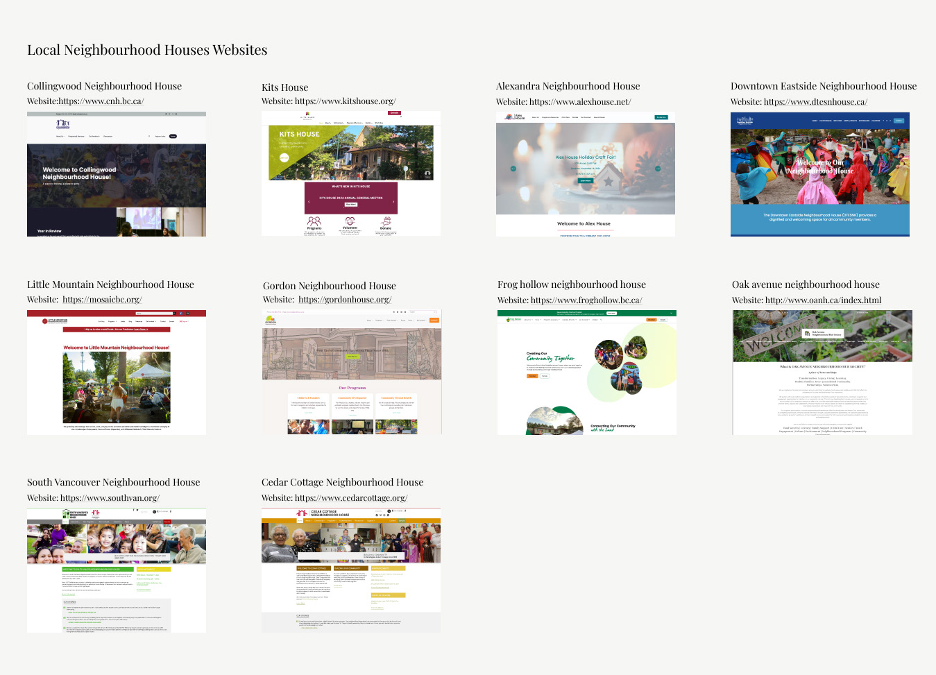
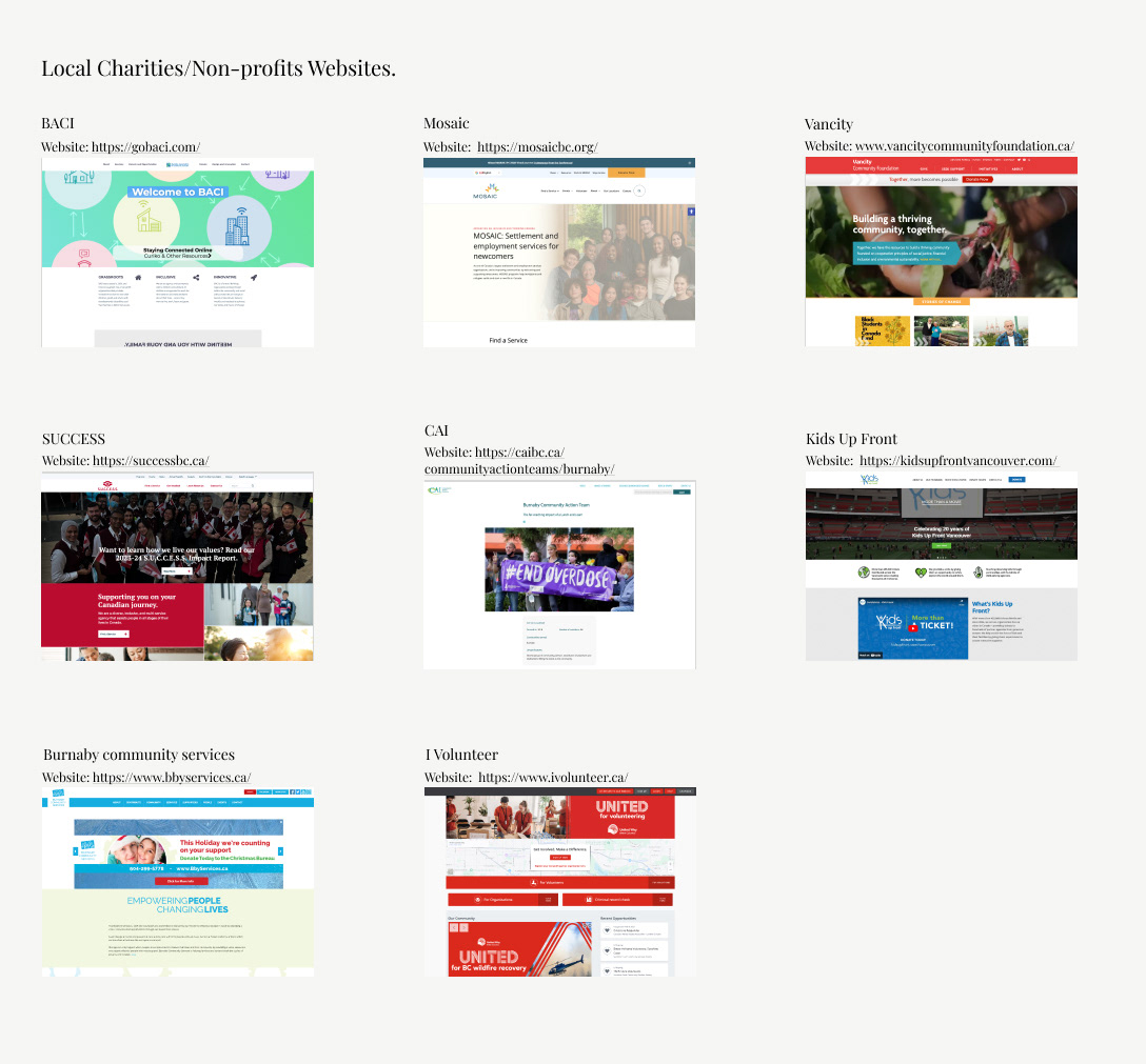
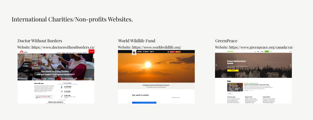
Competitive Analysis
I focused my research on website for different Neighbourhood Houses in BC Lower Mainland, complemented with a few BC Charities and international websites.
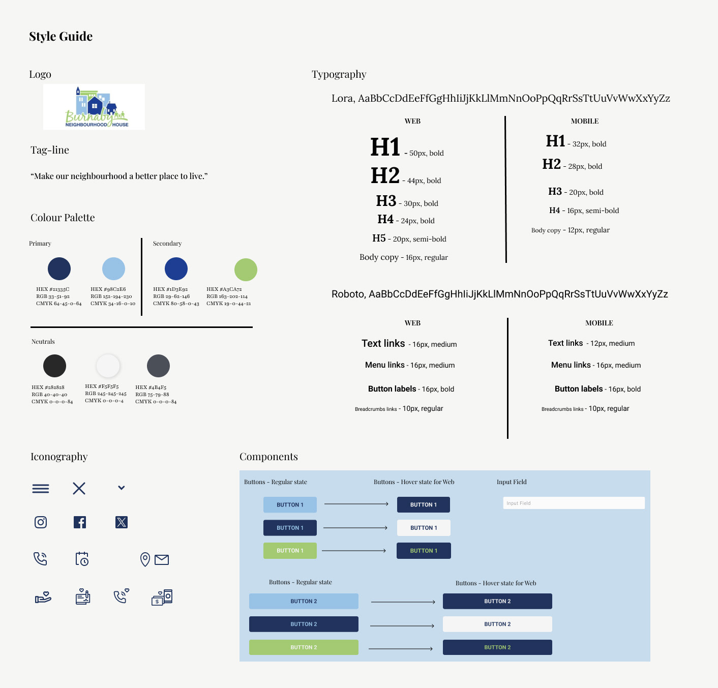
style guide
During this project I worked with the branding that BNH currently have. As they don't have a public Style guide available online, I decided to create one with the information from their current website regarding their logo, tagline and colour palette to ensure harmony in my design.
The typography, iconography and assets, were part of my re-design proposed solution.
Typography
I decided to use Lora font for the heading s and body copy to have a clear distinction between what is text and the links on the website. Lora is a well-balanced contemporary serif that conveys a professional yet inviting mood. It has good contrast, which is ideal for body text, and it is suitable for use on Web, mobile and print. It also has a 8 font styles (Regular, medium, semi-bold, bold, italic, medium italic, semi-bold italic and bold italic)
I decided to keep the Roboto regular family to use for the interactive text and items to reinforce the different between these and the copy. Roboto is a neo-grotesque sans-serif typeface family available for Web and Mobile, and it is also suitable for print. It has a simple, geometric and friendly design that allows for a more natural reading rhythm than other Grotesks fonts. It has a 9 font styles (Thin, extra-light, light, regular, medium, semi-bold, bold, extra-bold, black) making it very versatile
Iconography
Due to time constrains, I decided to use some icons source from www.iconfinder.com as a based for the icons used on the re-design of the BNH website. I created the hamburger menu, closing X and chevron from scratch, but for the social media and other icons I modified and tweak the design and changed the colour to reflect the brands palette.
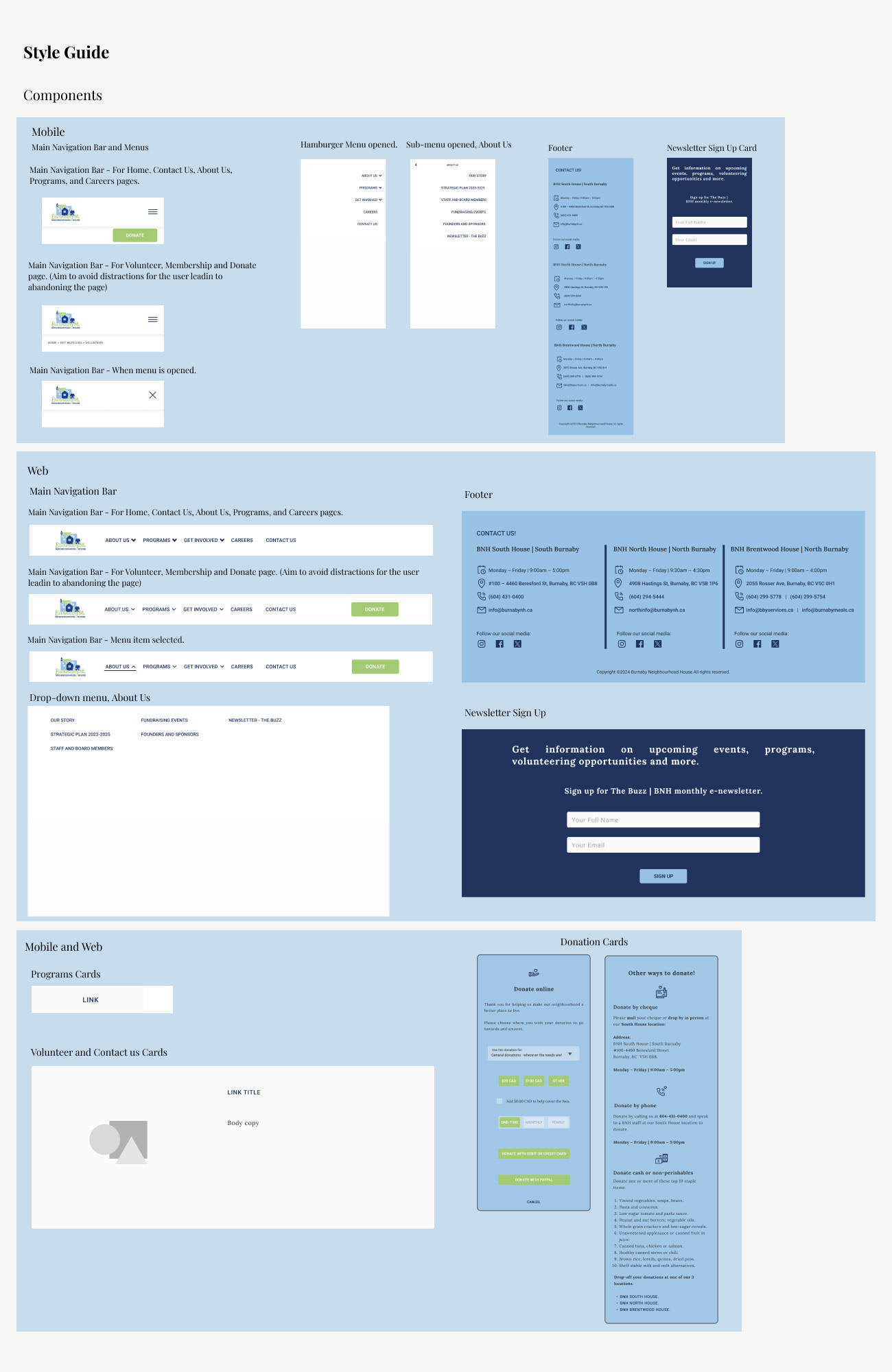
Assets | Components
I created components in Figma for the Buttons, Input box, Navigation bar, Footer, menu and different cards (newsletter, donation, programs, volunteers programs and contact) for the Mobile and Web Mock-ups in order to made modifications easier in cascade across the screens/pages, if needed
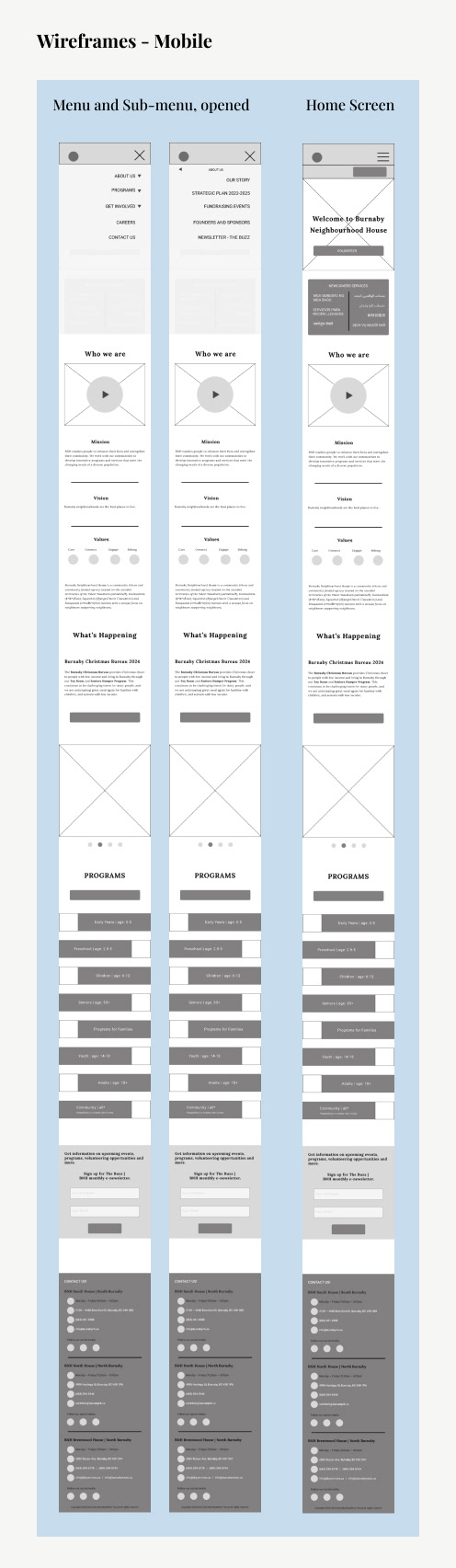
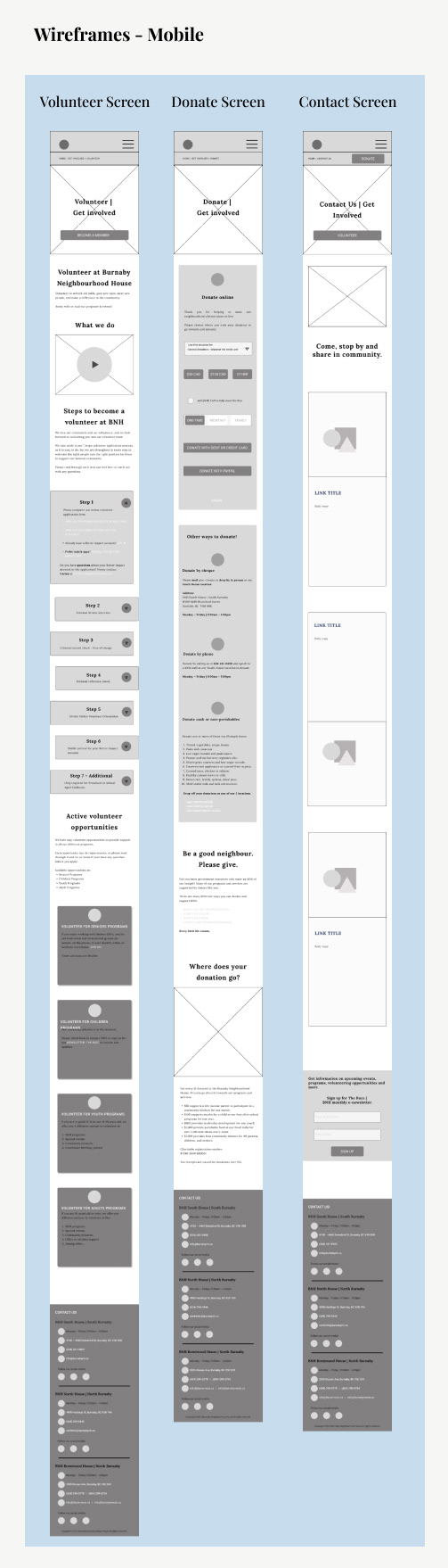
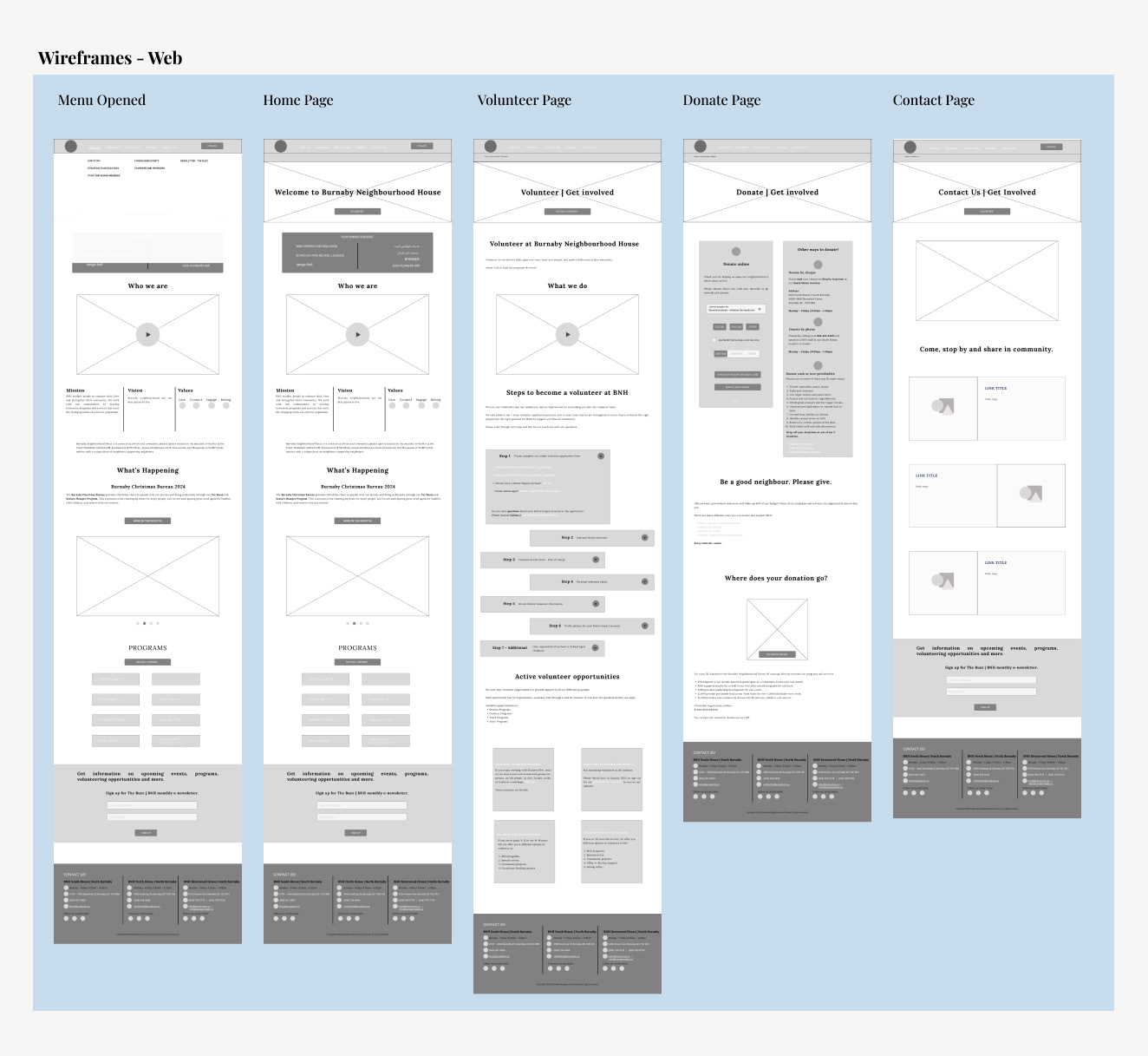
wireframes
During this stage (ideation), I first sketch some roughs wireframes of layout ideas for the mobile screens and webpages. From the options I created, I selected a couple to create wireframes on Figma using grey scale and some copy in order to better see the designs.
High Fidelity Mock-ups
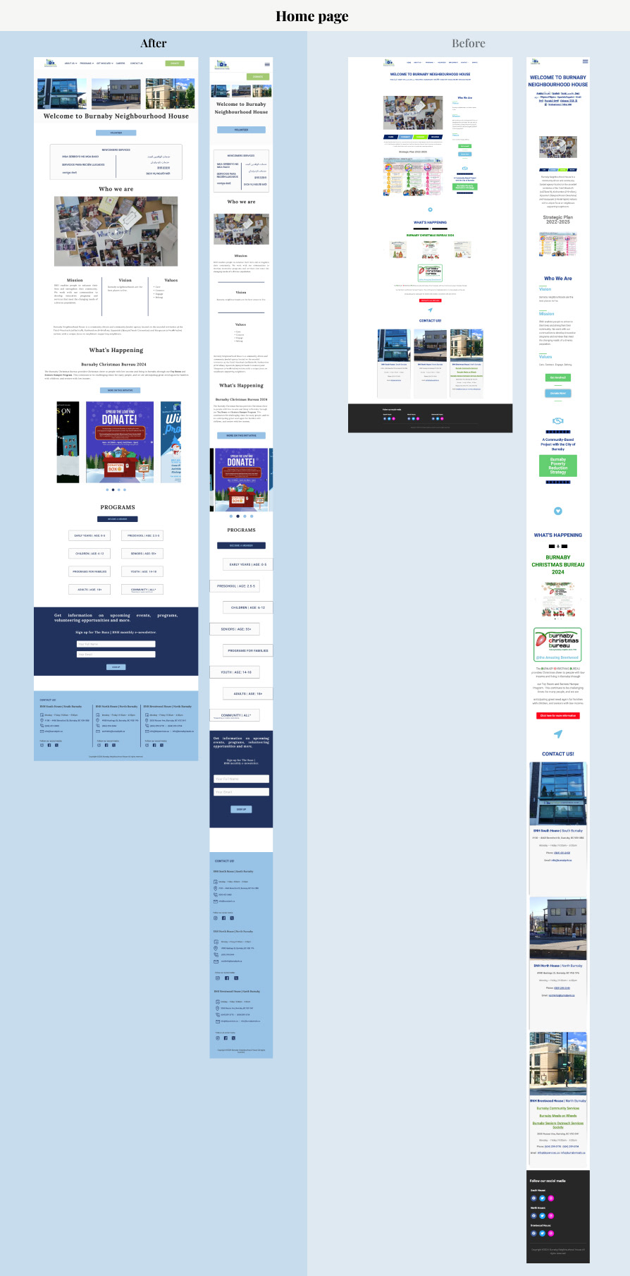
New design language vs the original design - Comparison
Having the layout and design choices defined, I proceeded to create mock-ups of the website for the mobile and web version. Below there is a short summary of my re-design rationale for each page.
Home Page
Re-design rationale
- I improved the Hierarchy of information by giving the information to the user in stages and having more negative space for the eyes to rest.
- Navigation bar is more functional and has only the main options on the menu, with a clear CTA to donate.
- Hero image shows all 3 BNH locations along the headline to welcome all neighbours.
- Easy access and clear secondary CTA to Volunteer under the hero image. Lower on the home page, clear CTA to become a member of BNH in the programs section.
- Easy and immediate access to services for Newcomers/ Immigrants wrote in their language to make it more accessible and avoiding confusions by translating the actual label of the link and not writing the name of the language on it.
- The homepage covers the most important information of the charity, defined in separate sections with clear CTAs.
- Proper scale for the carousel with images of upcoming events, programs and initiative with a clear CTA.
- Addition of the categories of the different programs available at BNH separate by age range.
- Addition of Newsletter sign up section to encourage users to keep inform and engage with BNH.
- Contact information and social media for the 3 locations is now available throughout the website on the Footer
- Responsive design.
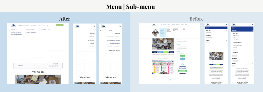
Main Menu | Sub-menu
Re-design rationale
I expanded the drop-down menu to cover up the whole screen making use of a gradient/blur effect to enhance the focus on the items. Also, items were re-arranged to make more sense and remove unnecessary information from the menu. (Users can exit the drop-down menu by clicking on the blur part or the X on the top right corner.)
For the user to know which item of the menu is selected, I specified it with the indicative of the underline and the chevron top side movement.
For mobile the menu becomes a Hamburger Menu that when opened, also covers up the whole screen with the gradient/blur at the bottom and the X option to exit it.
If an item with sub-menu (chevron) is opened, the menu changes, showing only the sub-menu of items, specifying on the top middle, the section in which the user is looking in, and allowing them to return to the main menu by using the back arrow or exiting the menu with the X.
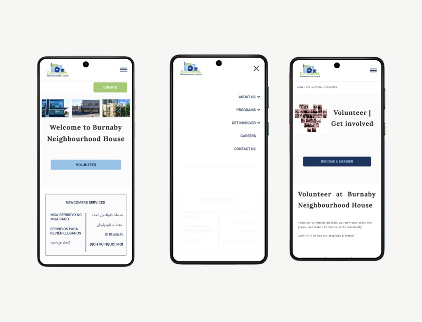
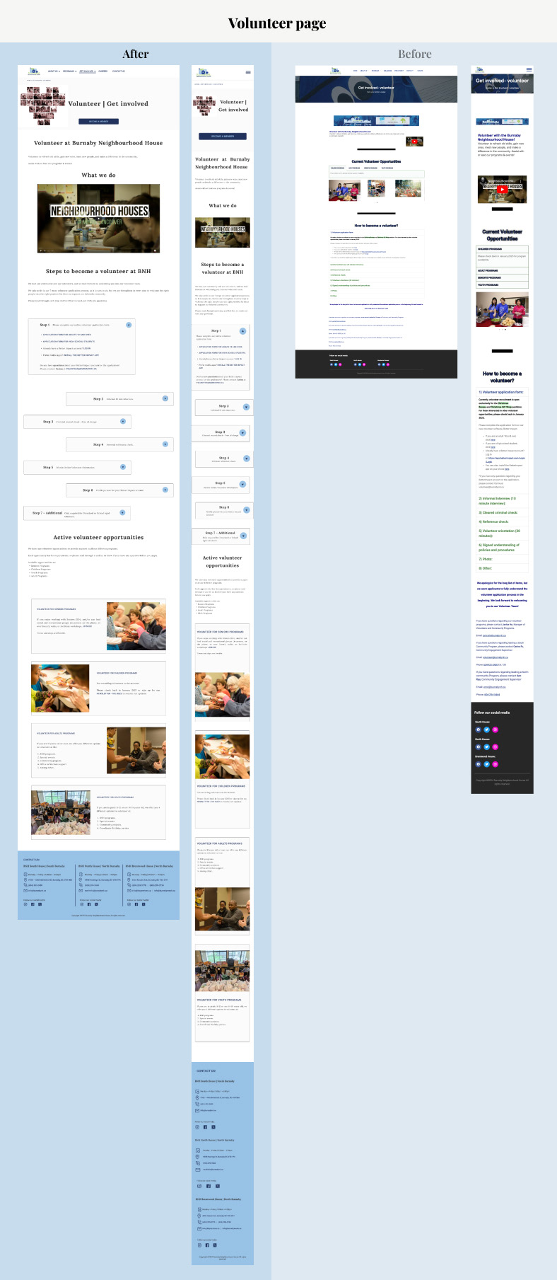
Volunteer Page
Re-design rationale
Changed the Hero image for the headers of all the pages (Volunteer, Donate, Contact).
I chose an image that will not obstruct and/or obscure the headings, clean and simple, but with meaning that will still convey the community and support message of BNH. By using the same image on all pages, the branding is reinforced.
Relocated the breadcrumbs to the top left side of the screen for better visibility.
Added more negative space by re-organizing the information and leaving proper spacing between the images and paragraphs.
Resized and centre the video that explains what BNH does.
Replaced the accordion style card that shows the steps of “How to become a volunteer at BNH” with a more modern look cards arranged like a ladder, adding a small introduction to the process and removing the apology message at the end of the process list.
Each step show the information on what to do, the links and the contact information.
Moved the current volunteer opportunities section to the bottom of the page, updating the cards with a modern style, where the information is displayed, and adding BNH images to reinforce the message.
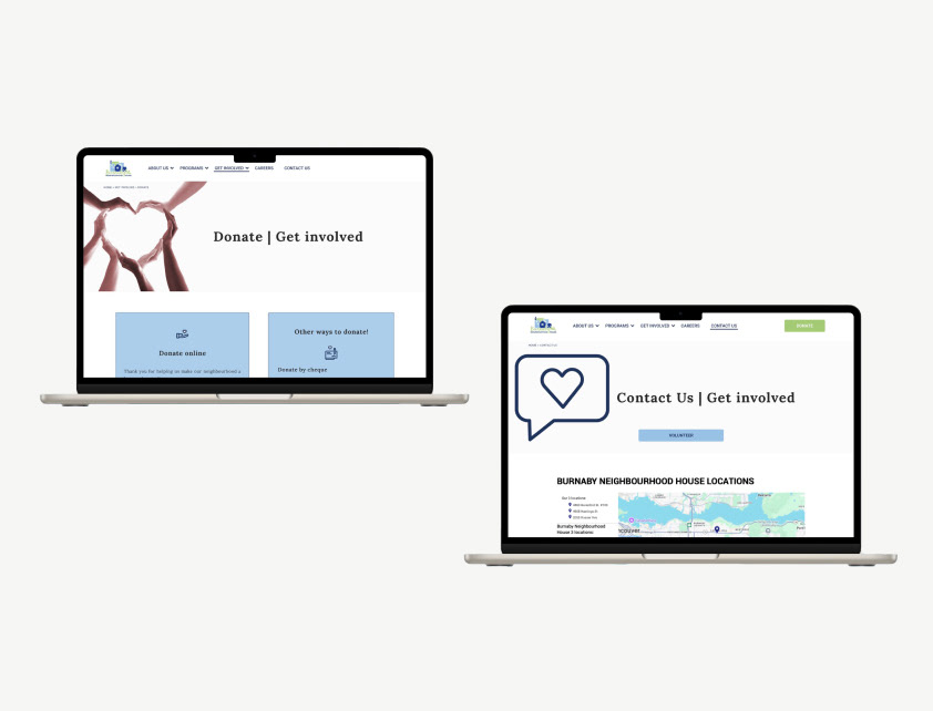
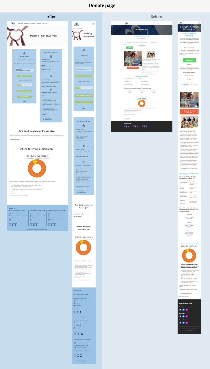
Donate Page
Re-design rationale
Removed the discrepancy of the donate button. As they have one “Donate” link that takes the user to a page with information on how and what to donate to BNH and a “Donate Now” button that takes the user to a PayPal payment card.
Now, when clicking the “Donate” button or link (located under “Get Involved” in the main menu) the user will arrive to the same page, where they can see the PayPal card to donate online and a card with the information of additional ways they can donate.
I added iconography on top of the information to reinforce the message.
I designed the PayPal card to reflect the brand’s colours.
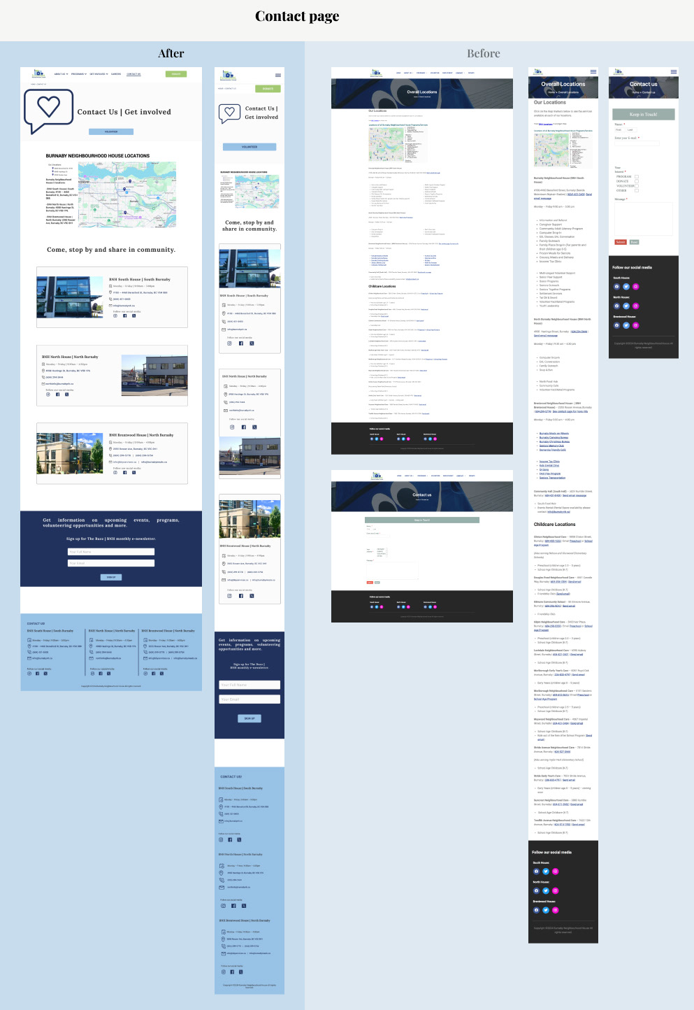
Contact Page
Re-design rationale
Currently, the website is designed in a way that may cause confusion in the users, specially new ones, as by clicking on the “Contact Us” link only a email form (that do not specify which BNH location email is send to) shows and hidden in the sub-menu there is a “Service locations” link, but it shows not only the information of the 3 BNH locations, but also all the schools and child care locations they are partner with.
My objective was to made a clean and simple “contact us” page, where users can easily find a map and the information for the 3 main BNH locations.
From this page, users can easily go to the main CTAs of BNH (Donate, volunteer and subscribe to the newsletter)
The information about the schools, child care facilities and other partner facilities, will be under the specific program that these facilities host.
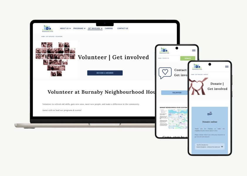
Device Mock-ups